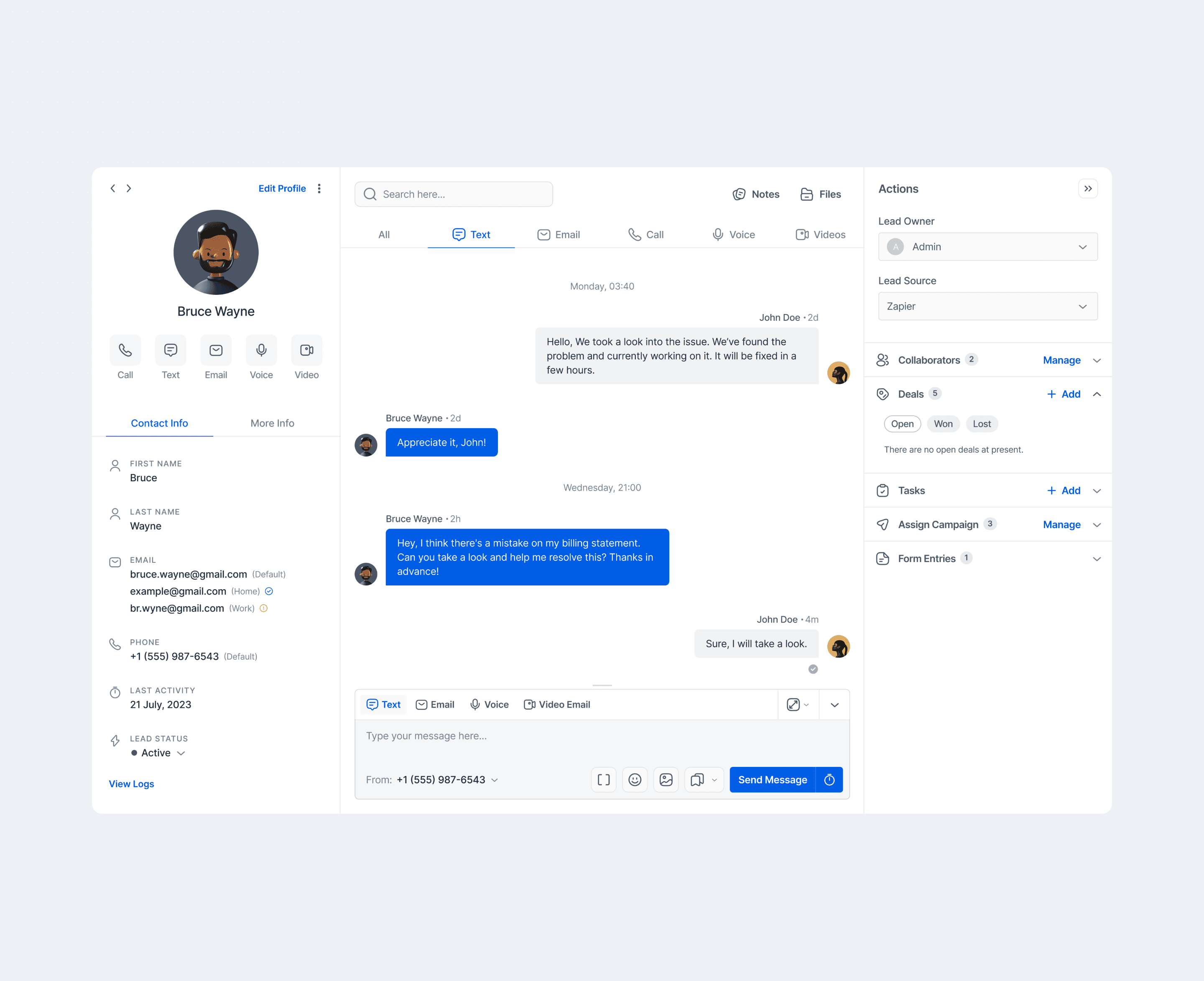
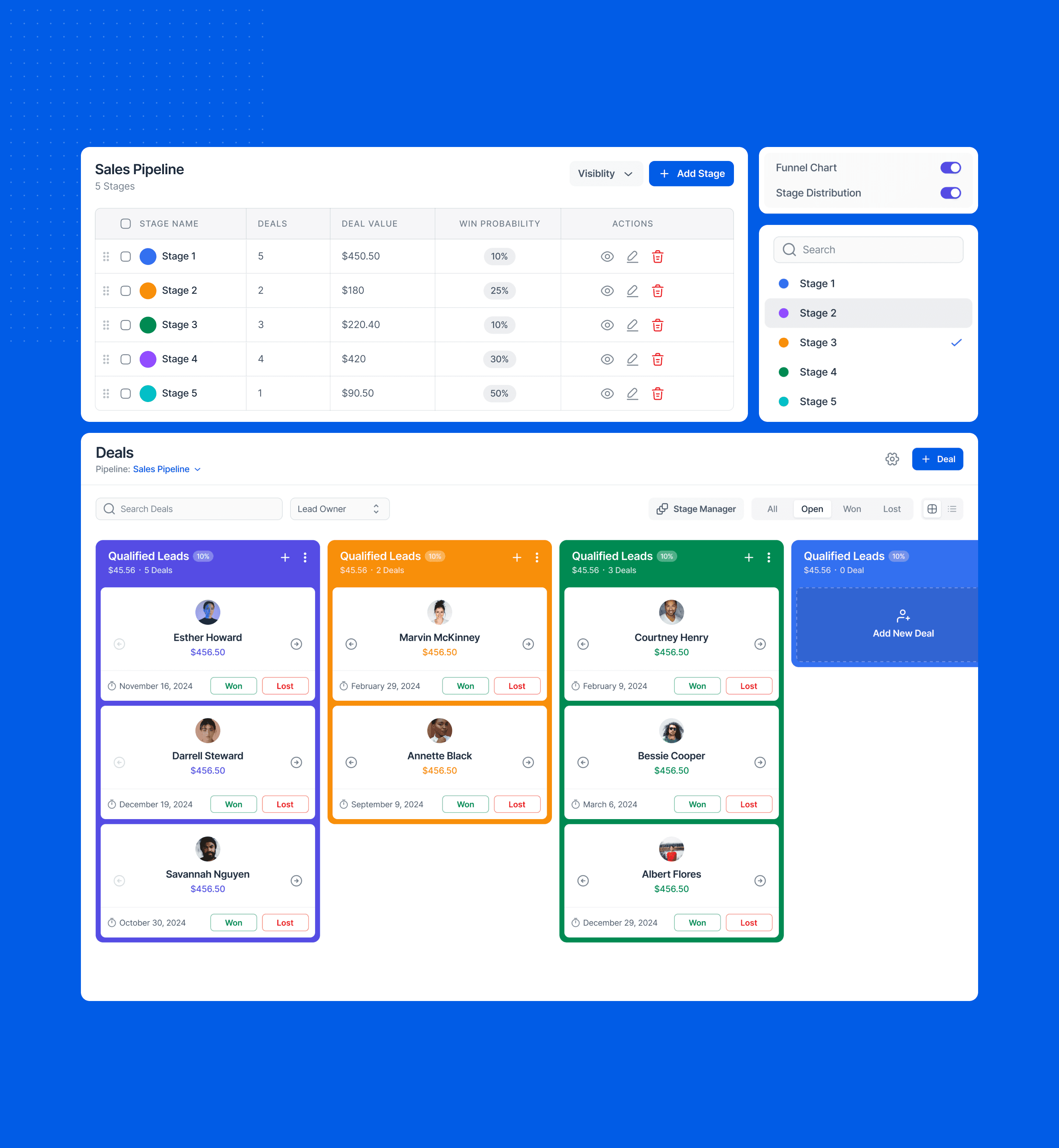
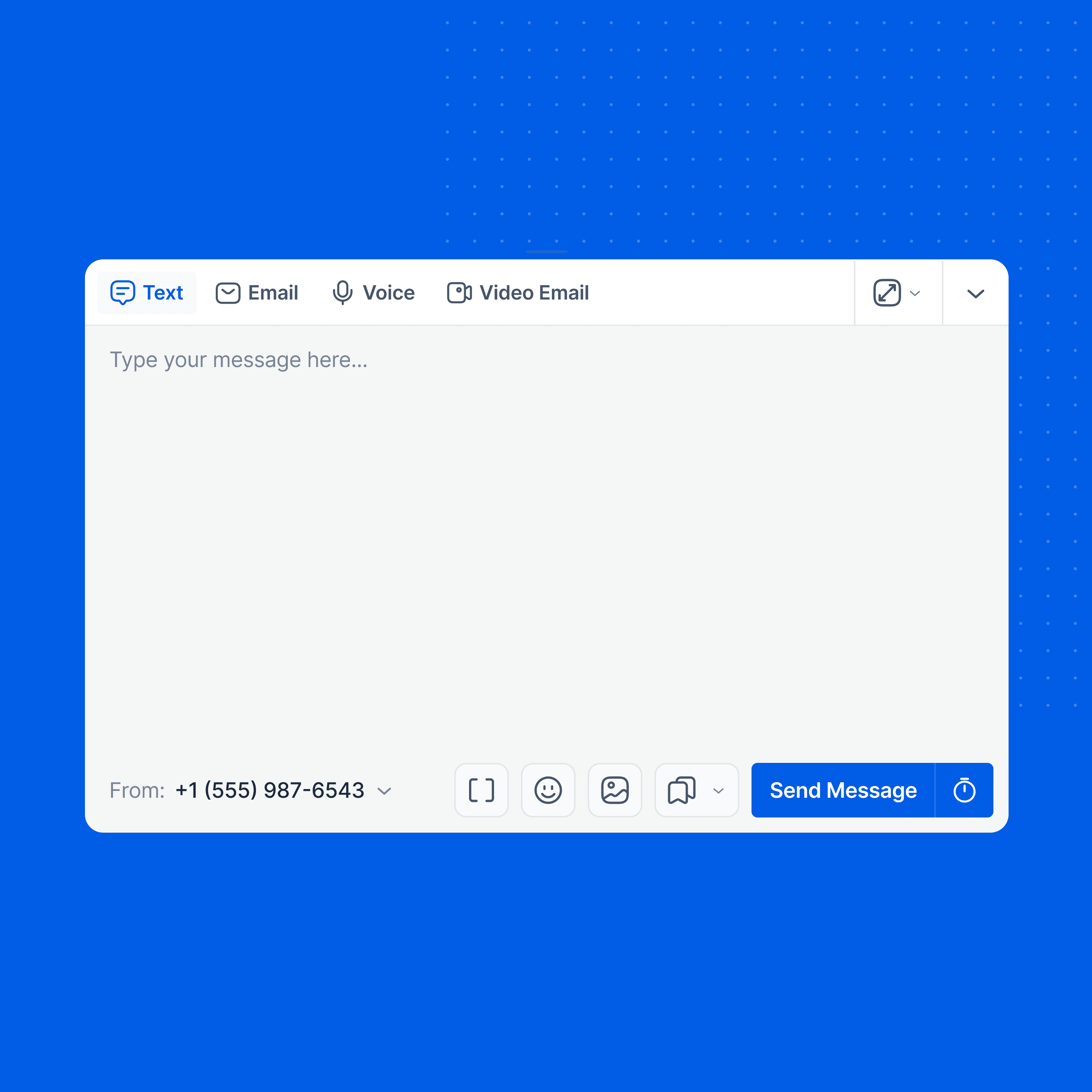
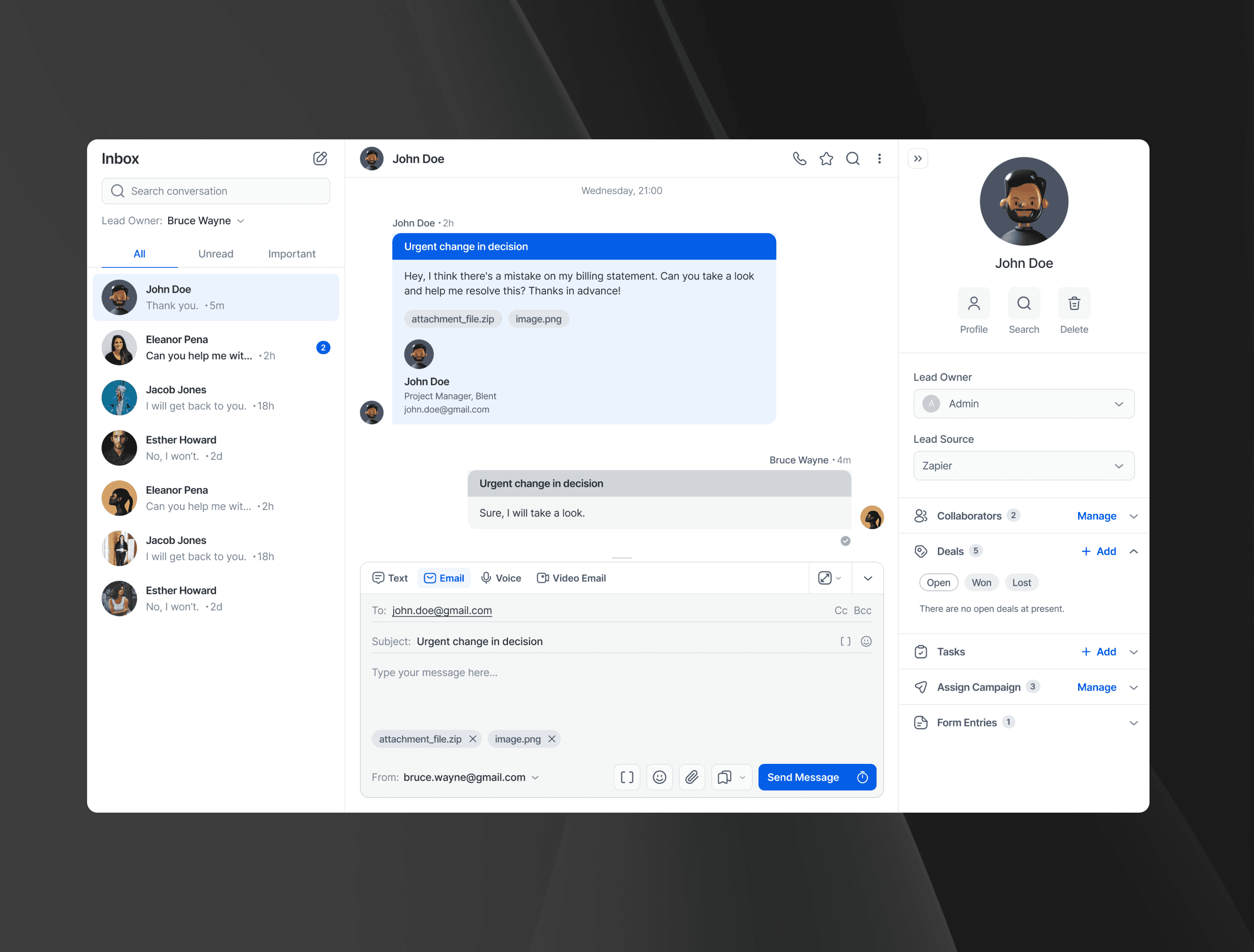
A platform with powerful CRM tools
LeadsUp is a CRM platform that helps build meaningful relationship with customers. It offers some powerful tools to help businesses maintain and close deals effectively.
Category
B2B SaaS
work type
Web App
Year
2024
Duration
6 months
A platform with powerful CRM tools
LeadsUp is a CRM platform that helps build meaningful relationship with customers. It offers some powerful tools to help businesses maintain and close deals effectively.
Category
B2B SaaS
work type
Web App
Year
2024
Duration
6 months

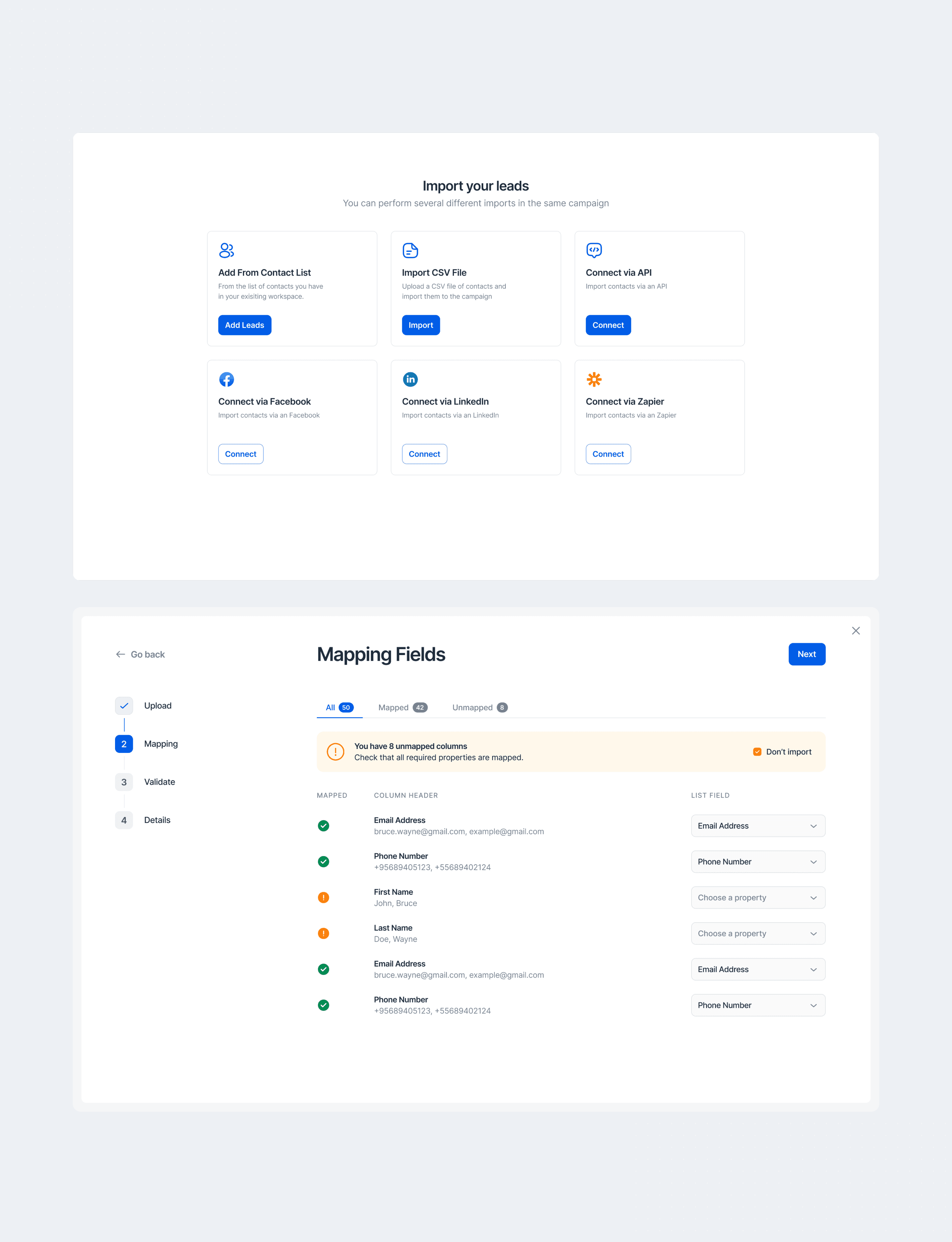
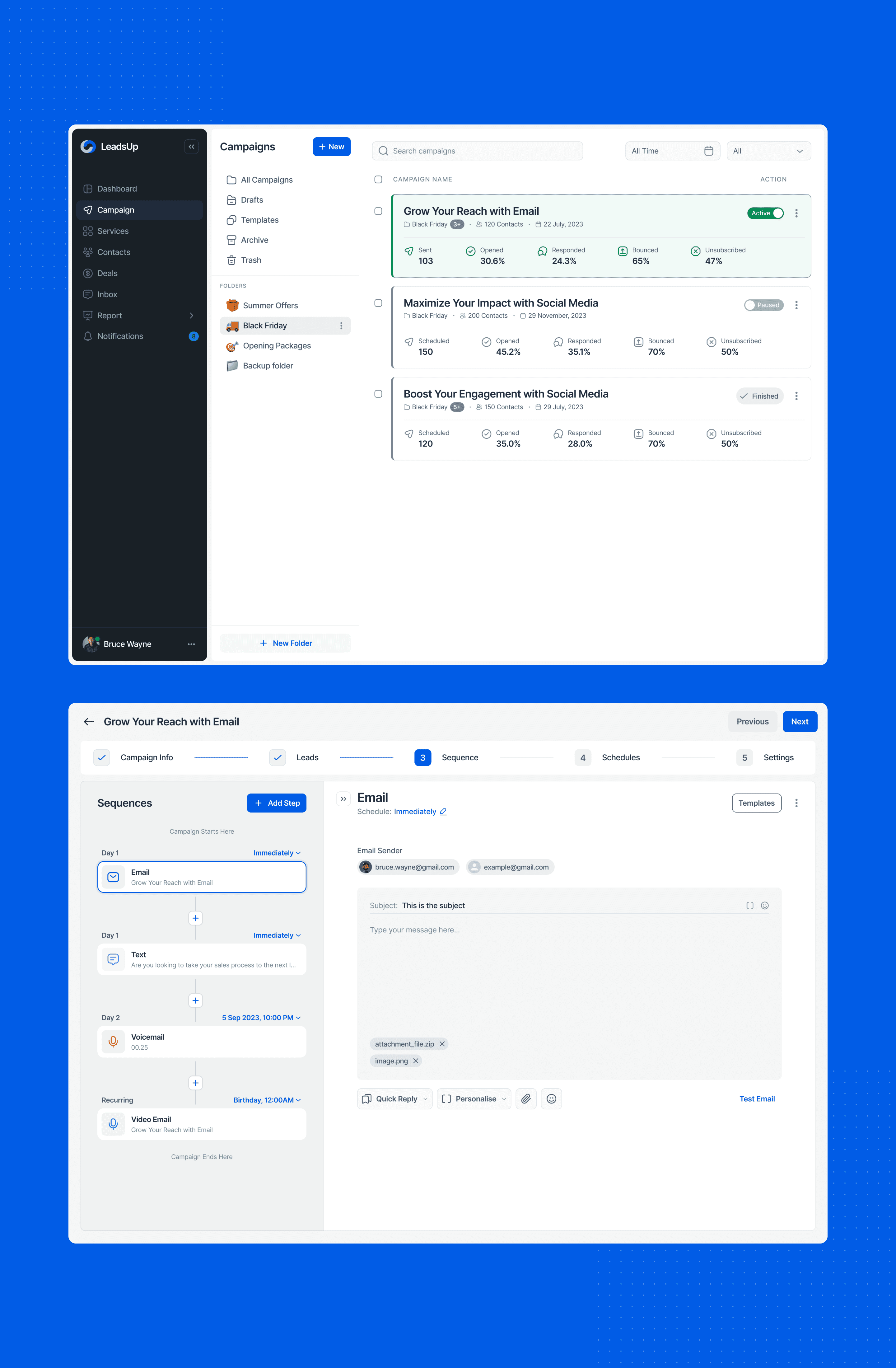
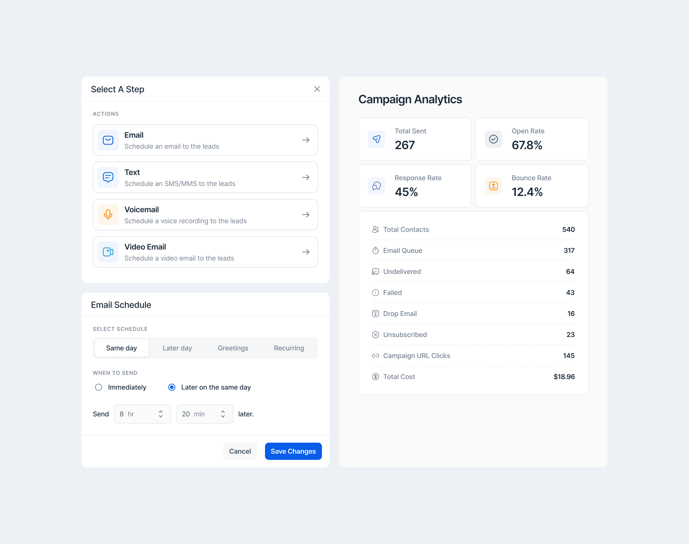
Challenge
The product had to unify scattered sales workflows into one surface that feels fast and obvious from the first click.
Designing a CRM that genuinely stands out in a crowded, look-alike market, through a modern visual language and a frictionless, learn-once UX while shipping on a strict timeline.
Differentiating without feature bloat, keeping accessibility and data trust high, and building a scalable system of components that the team could deliver quickly and evolve confidently.
My Approach
I turned the brief into three simple goals- look modern, feel easy on the first try & ship fast.
I skimmed key competitors to see what felt the same everywhere and where we could be different. Then I wrote a short set of design principles and success metrics. I locked scope with a must/should/won’t list so we could move quickly without drifting.
My Approach
Pen & paper first
I began in a notebook, not Figma- quick sketches to map user flows & screen ideas. I ran short brainstorming bursts to widen ideas, then circled the best patterns and trimmed the rest.
Sharing these low-fi sketches with engineers and stakeholders early helped check feasibility and naming before any heavy design work. Only after we aligned on the flow and structure did I move into Figma to formalize components and visuals, so high fidelity reflected clear thinking, not guesswork.
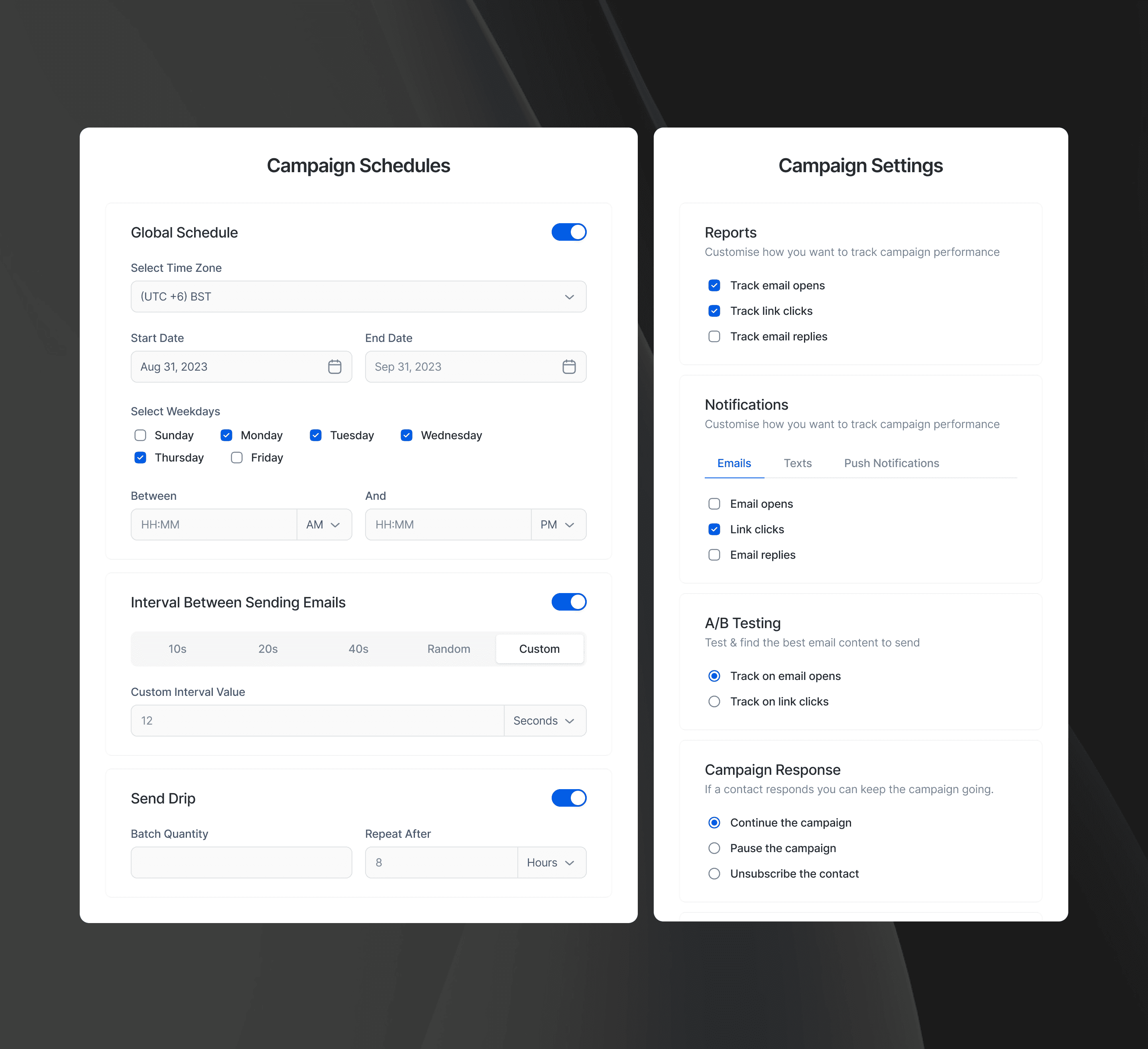
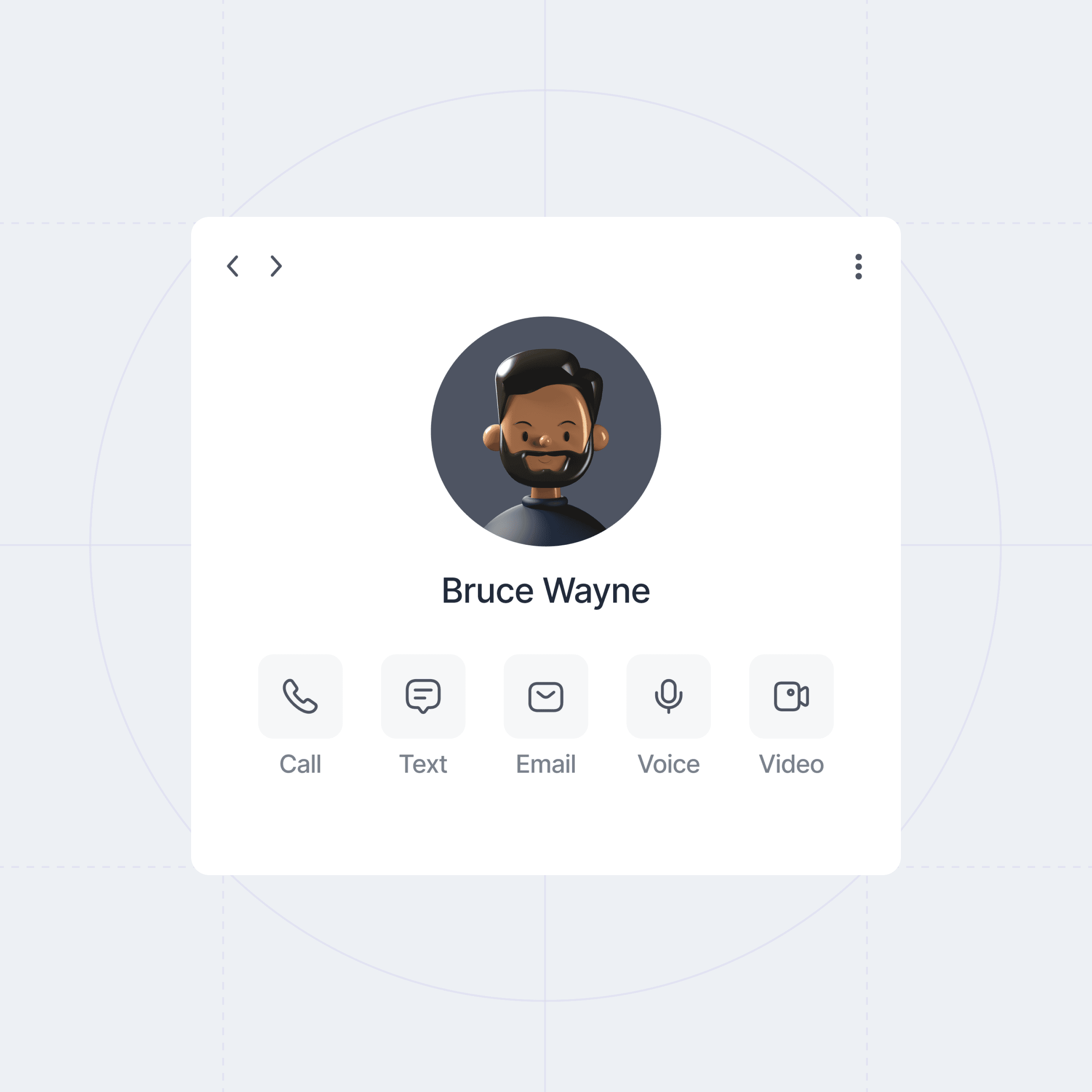
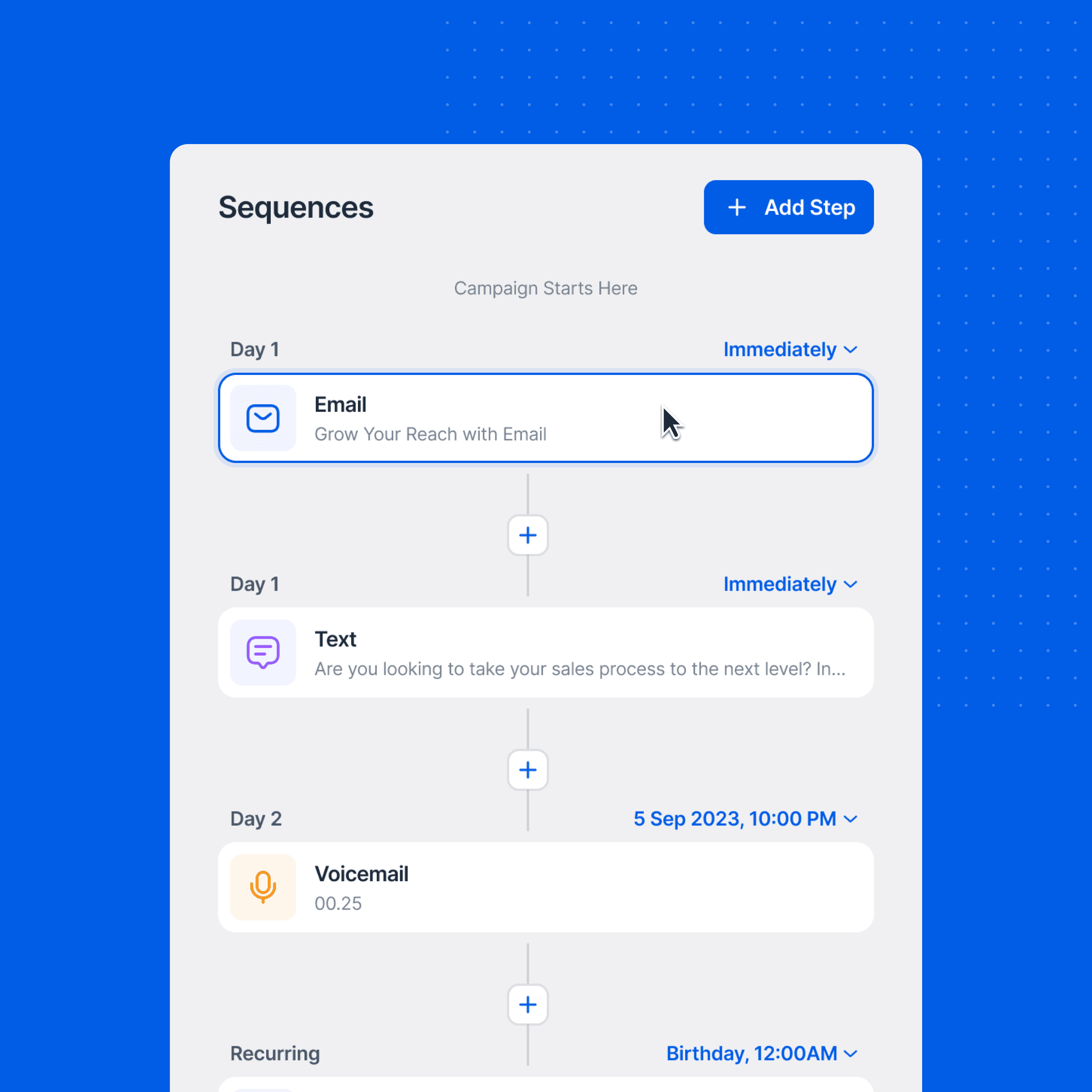
System before screens
Before designing pages, I built a small design system- type scale, spacing, color rules, and motion basics. I made a core set of components with clear states (empty, loading, error, success) and checked accessibility early. This kept the look coherent, reduced rework, and gave engineering reusable tokens to build faster.
Time management
I time-boxed exploration, ran system work and core flows in parallel, and batched feedback to avoid context switching. Daily check-ins, a living decision log, and protected focus blocks kept velocity high without last-minute scramble.
Working with developers
I worked side-by-side with engineers in short loops- check feasibility, sketch, prototype, and adjust to real constraints. We set a small token-based design system early so Figma and code stayed in sync.
When trade-offs came up, we logged the decision and moved on. I did quick QA in staging with realistic data to catch state and accessibility issues early- simple rhythm, clear ownership, shipped on time.