Designing the rules engine that runs payroll for 50,000 workers
Timerack is a workforce management platform for staffing agencies. I led product design across the compliance policy engine, pay-bill reconciliation flow, and ATS integration, roughly 100+ screens spanning the platform's most complex territory.
Category
Staffing / HR Tech
work type
Web App
Year
2026
Duration
3 Months

Context
Staffing companies run on margin razor's edge
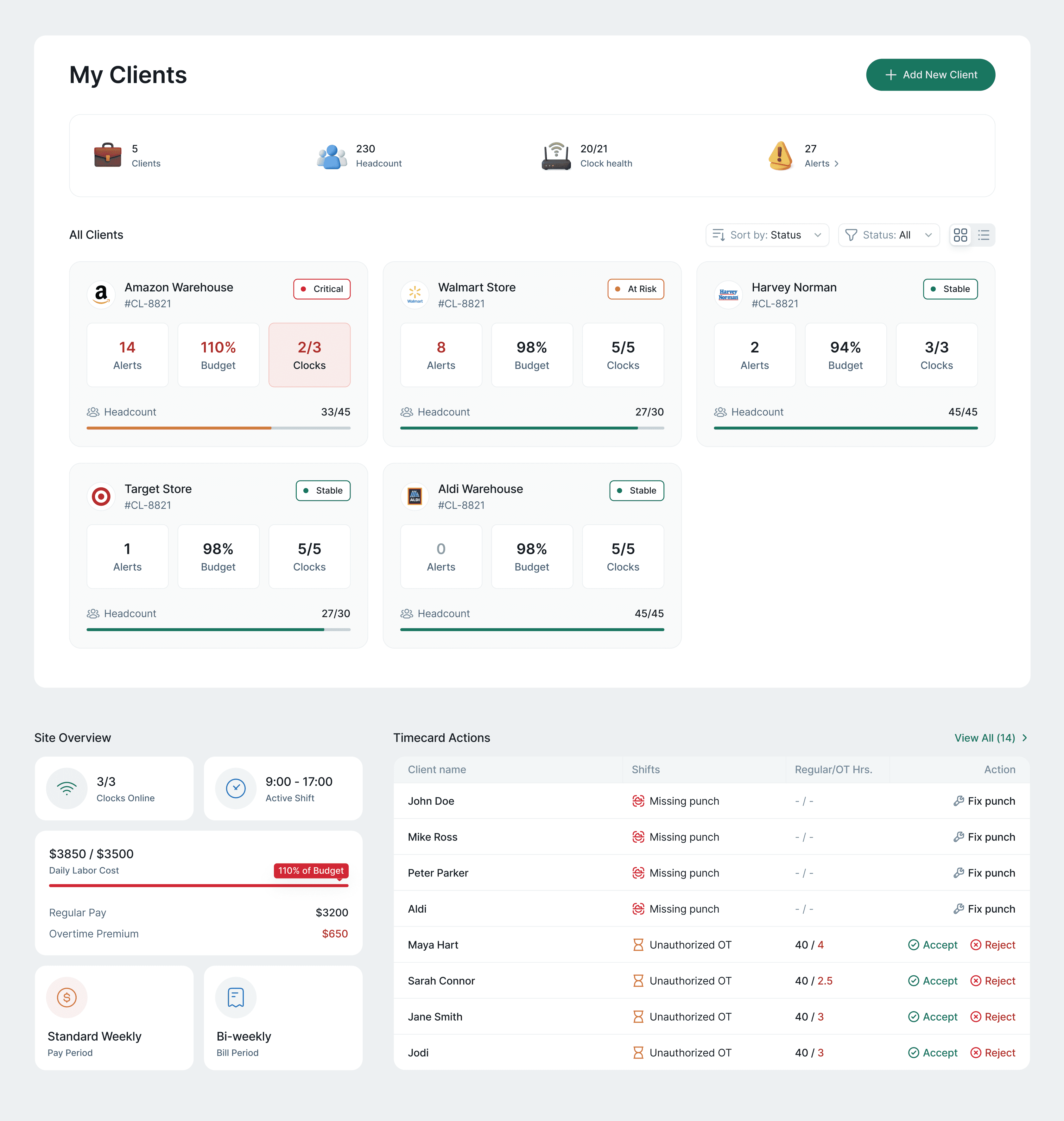
Timerack serves the $200B+ temporary staffing industry, companies like Amazon Warehouse, Walmart, and Target that rely on agencies to fill hundreds of hourly shifts every week.
What makes staffing different from any other employer: agencies are simultaneously the payroll engine (they pay the workers) and the invoicing vendor (they bill the client). A single timesheet error, multiplied across 200 client sites, can quietly erase an entire month of profit.
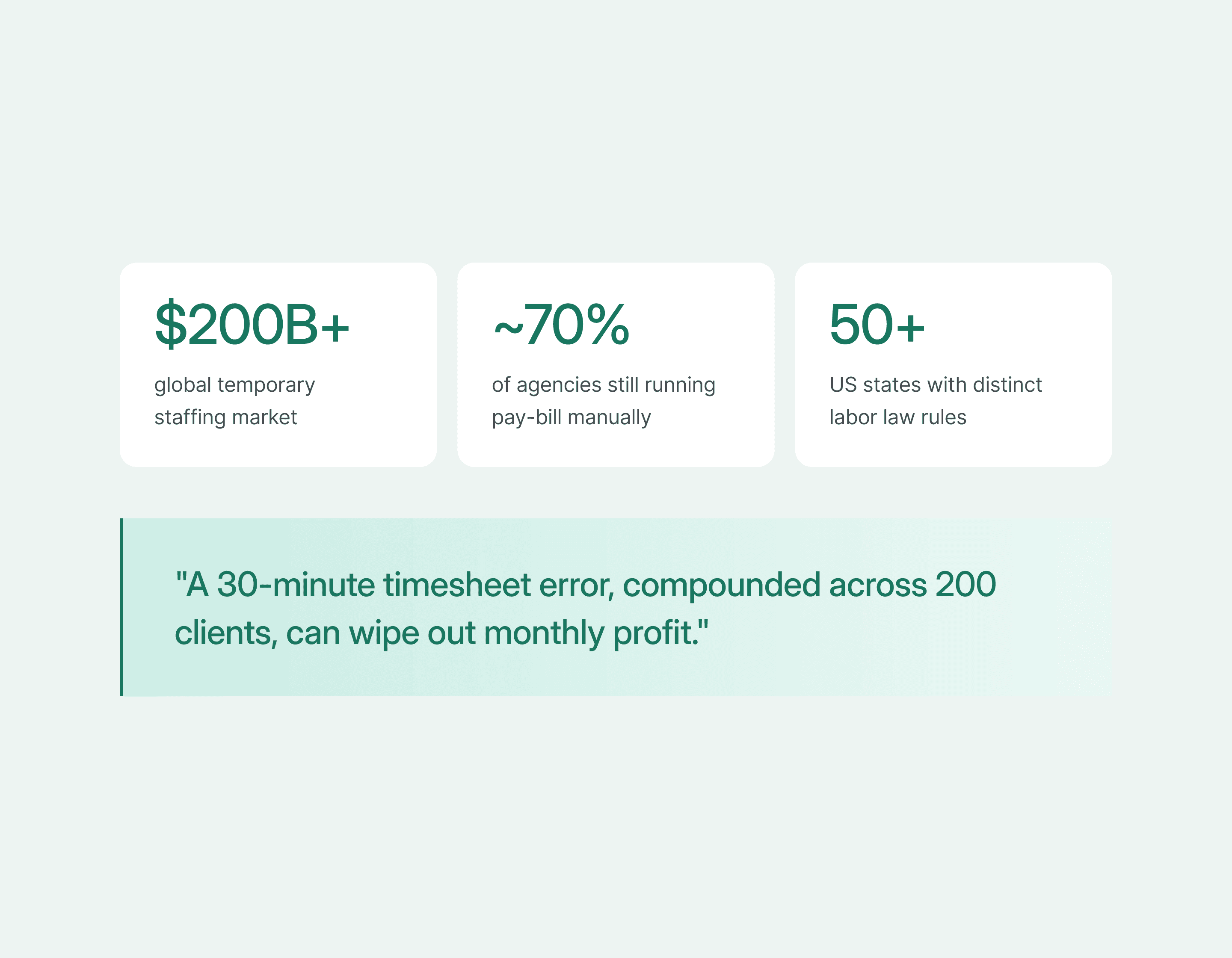
Before Timerack, most agencies under $50M revenue ran this process in Excel and email- manually calculating overtime, rounding punches by hand, and hoping nothing fell through when payroll ran on Monday morning.
#1 Challenge
Three people, completely different definitions of "wrong"
Before I could design anything, I needed to understand that Timerack doesn't have one user- it has three, each with radically different failure modes and working rhythms.
The agency operations manager is fighting fires across client accounts in real time. The payroll administrator runs a precise weekly cycle and is allergic to surprises. The compliance officer lives in fear of the words "wage and hour audit." None of them think about the product the same way.
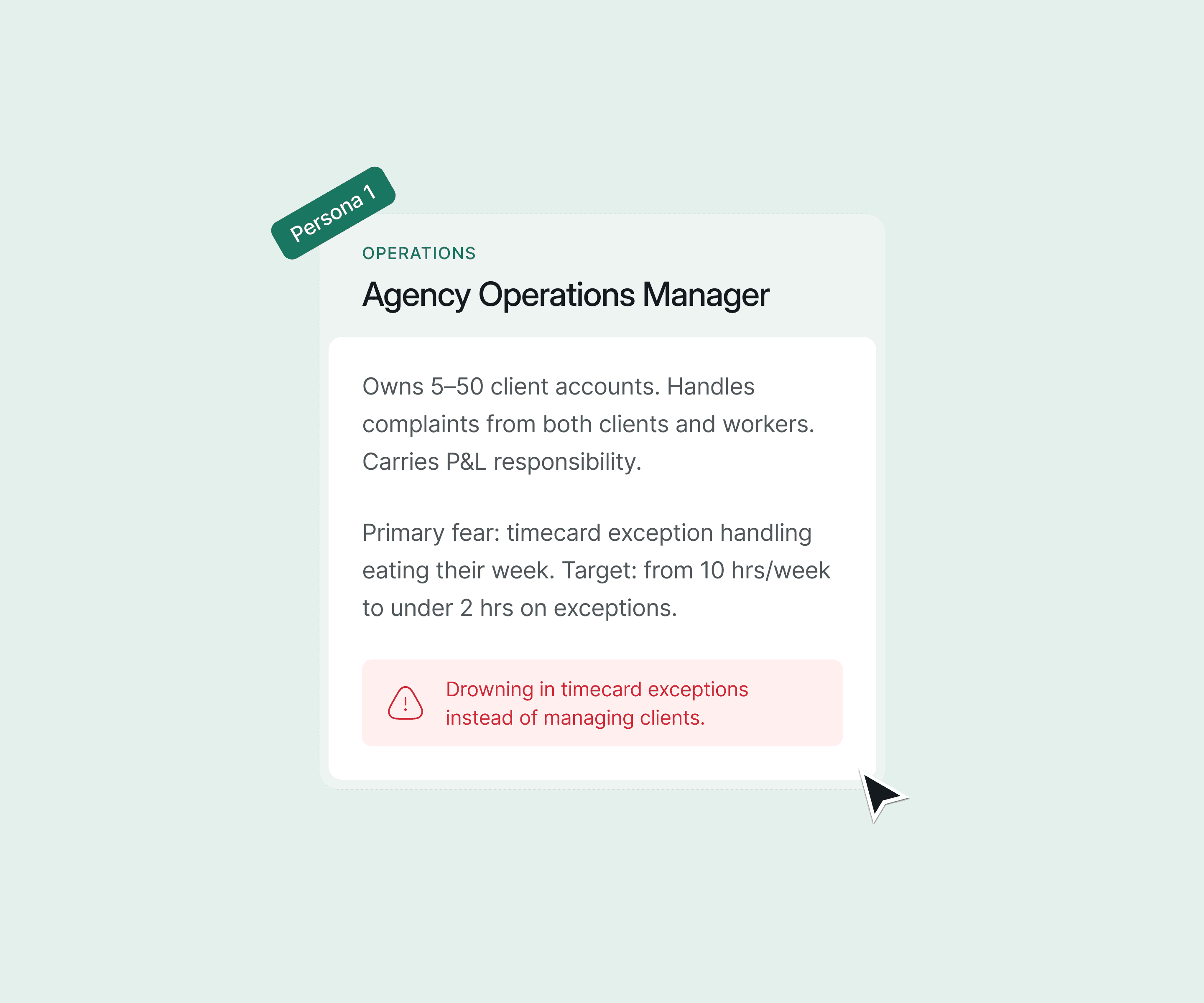
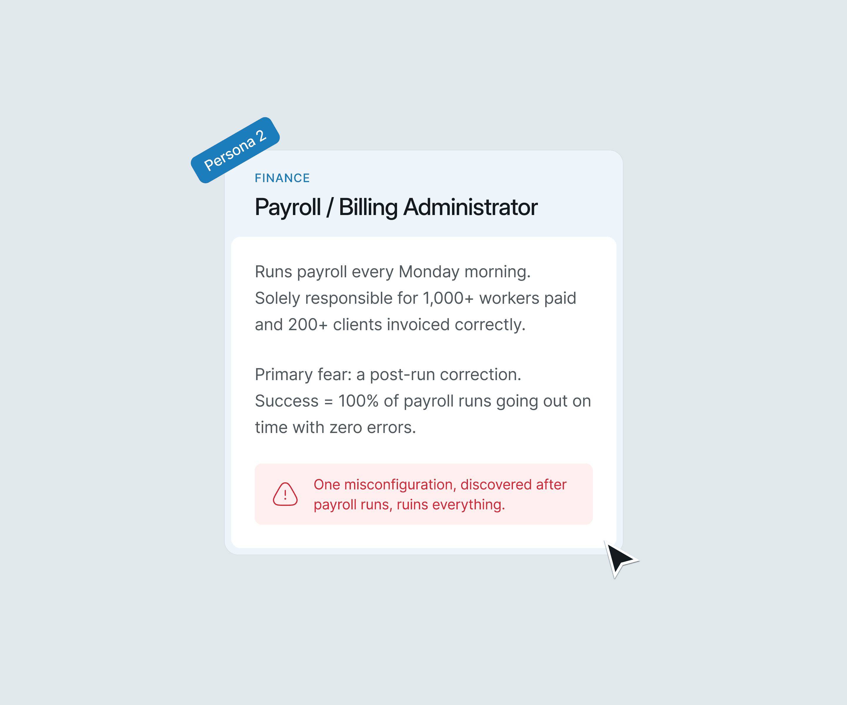
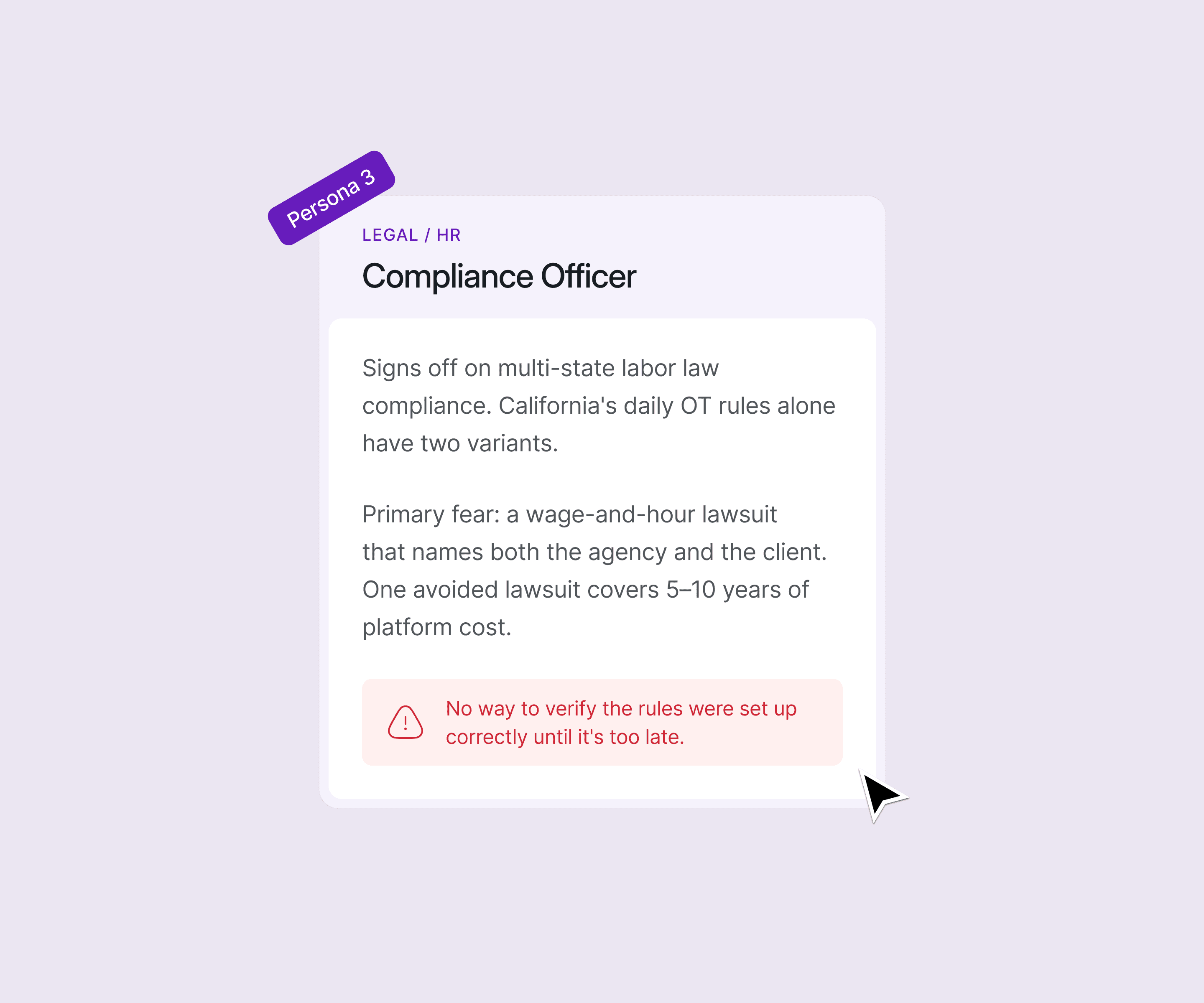
What made this especially hard: all three users touch the same underlying data (timecards, policies, punches) but at different times, with different permissions, and with totally different tolerances for ambiguity.
Designing one surface that served all three without becoming a tangled mess of conditional UI was the central design challenge of this project.
#2 Challenge
You can't design what you don't understand. So I learned the industry first.
I came into this project with no prior knowledge of the staffing industry, not the business model, not the compliance landscape, not the vocabulary. Terms like pay-bill duality, joint-employer liability, ATS field mapping, and California Alternative Workweek weren't just unfamiliar; they were load-bearing concepts that directly shaped every design decision.
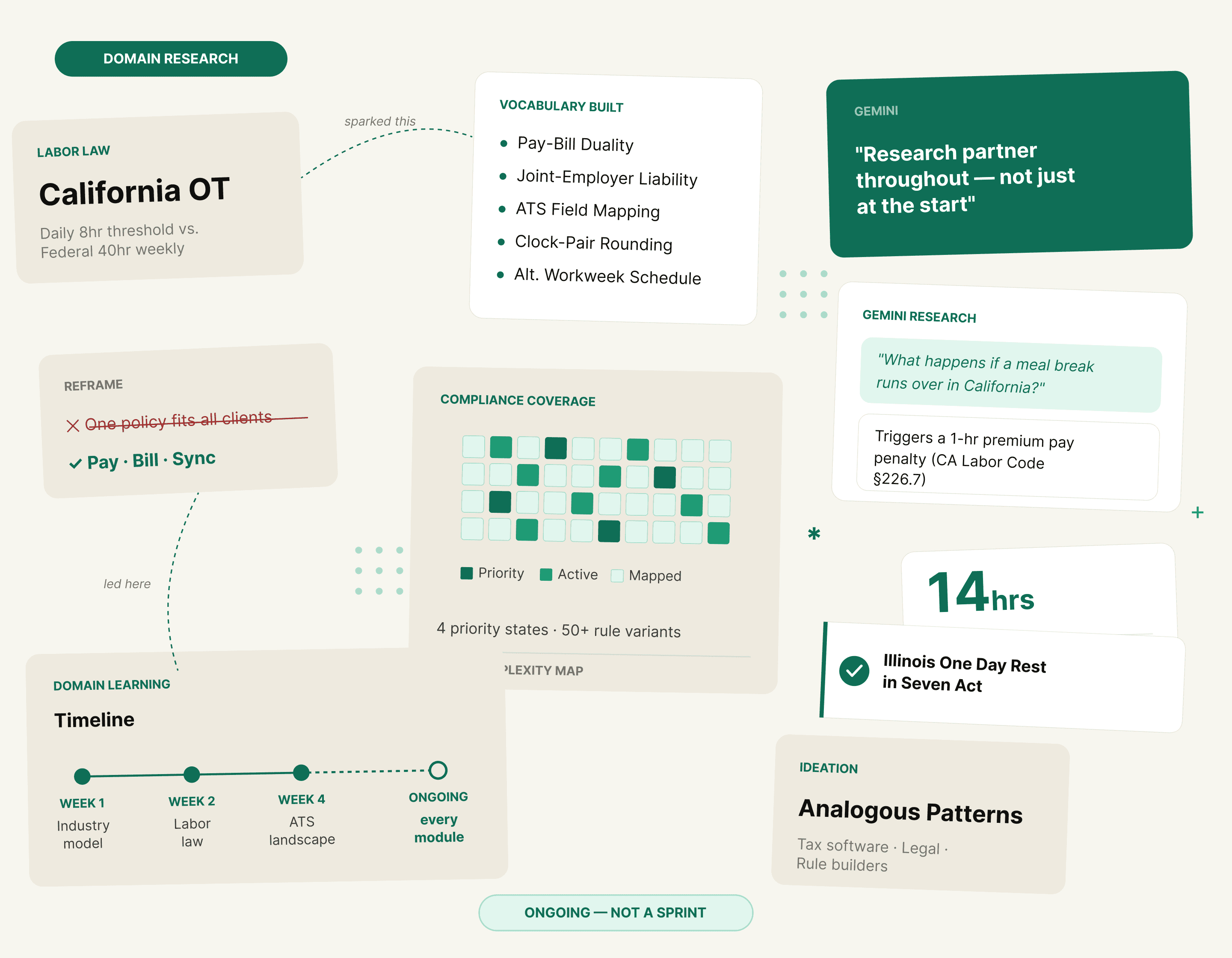
Rather than waiting until research was "done" to start designing, I treated domain learning as a continuous thread running through the entire project. Every new screen I worked on surfaced new questions, which sent me back to understanding the underlying industry logic before putting anything on the canvas.

Design Decision #1
Visual timeline diagrams as the trust mechanism for rule configuration
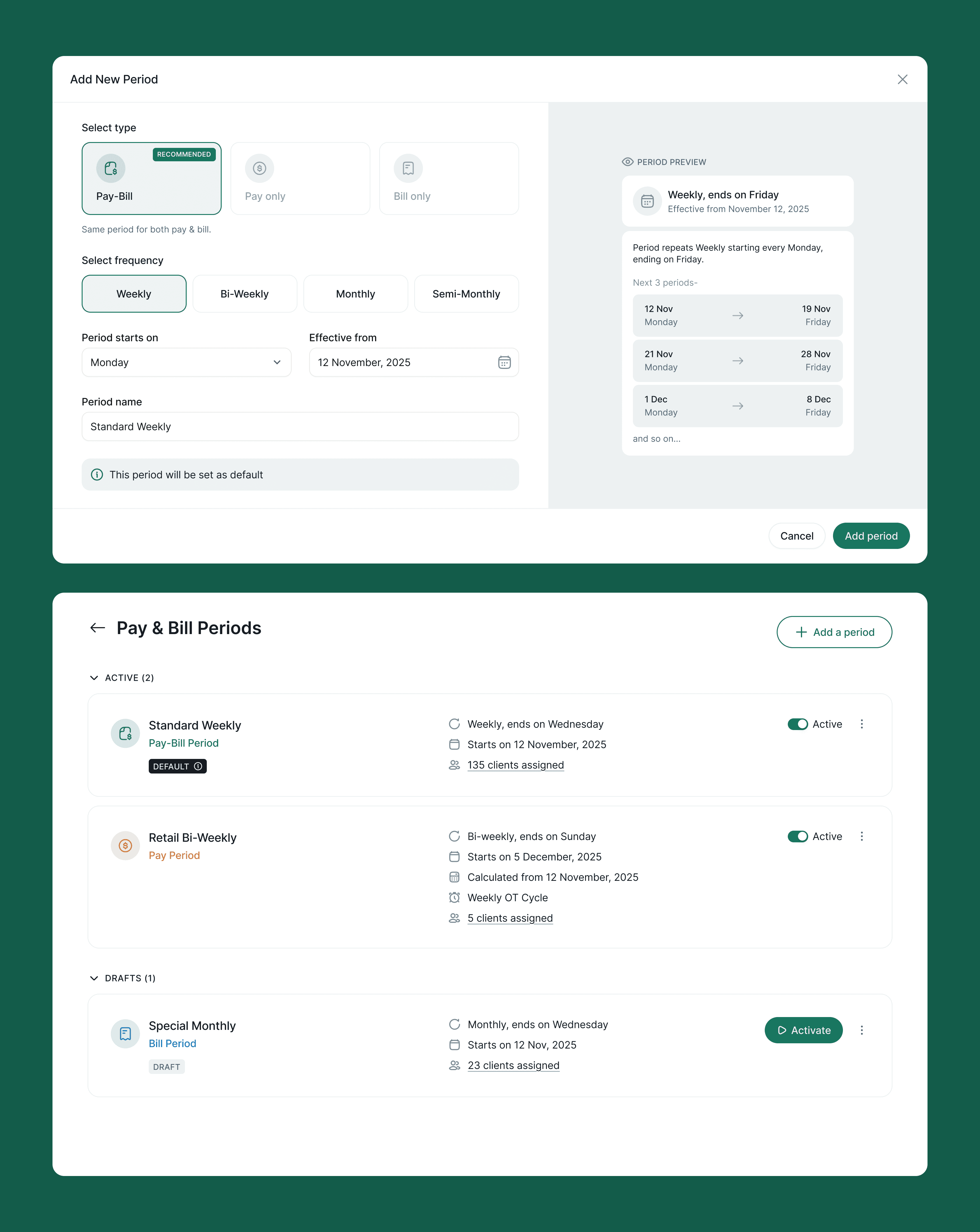
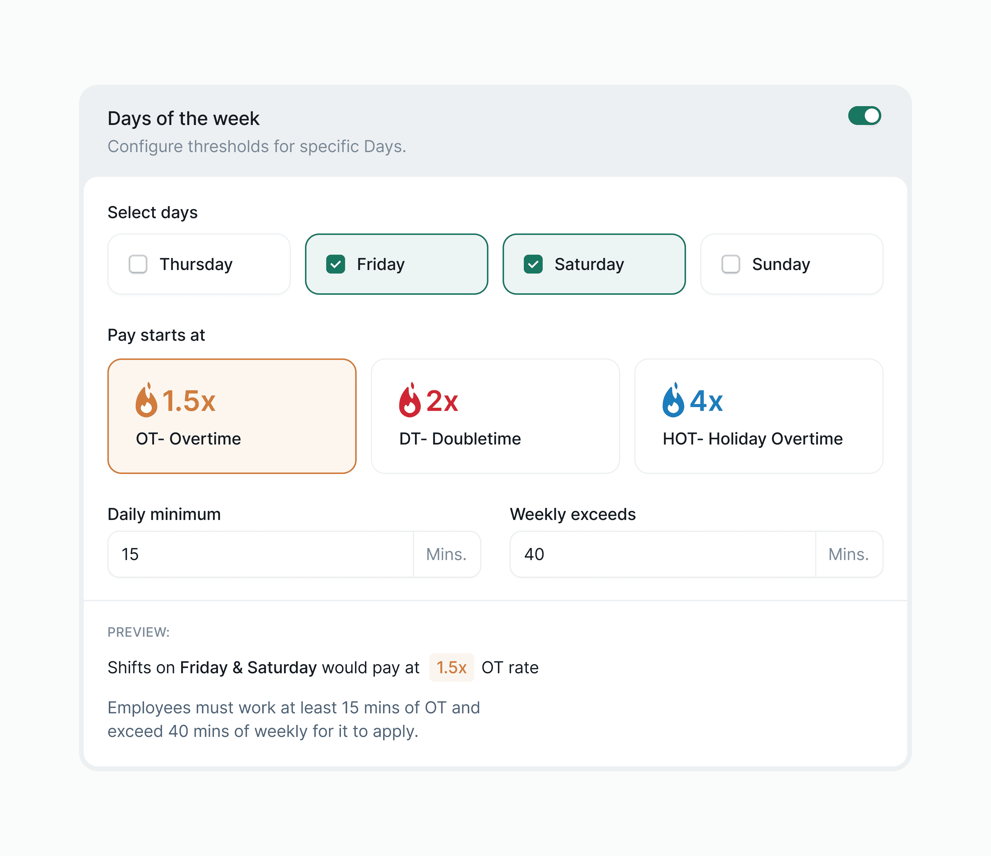
The rounding rules are genuinely complex: 20/70 rounding, 7/6/7 rounding, midpoint rules, custom increment and grace period combinations. Text descriptions alone were causing misconfiguration. A payroll admin configuring a rule that will affect 50,000 paychecks needs to see the consequence of the rule, not just the parameters.
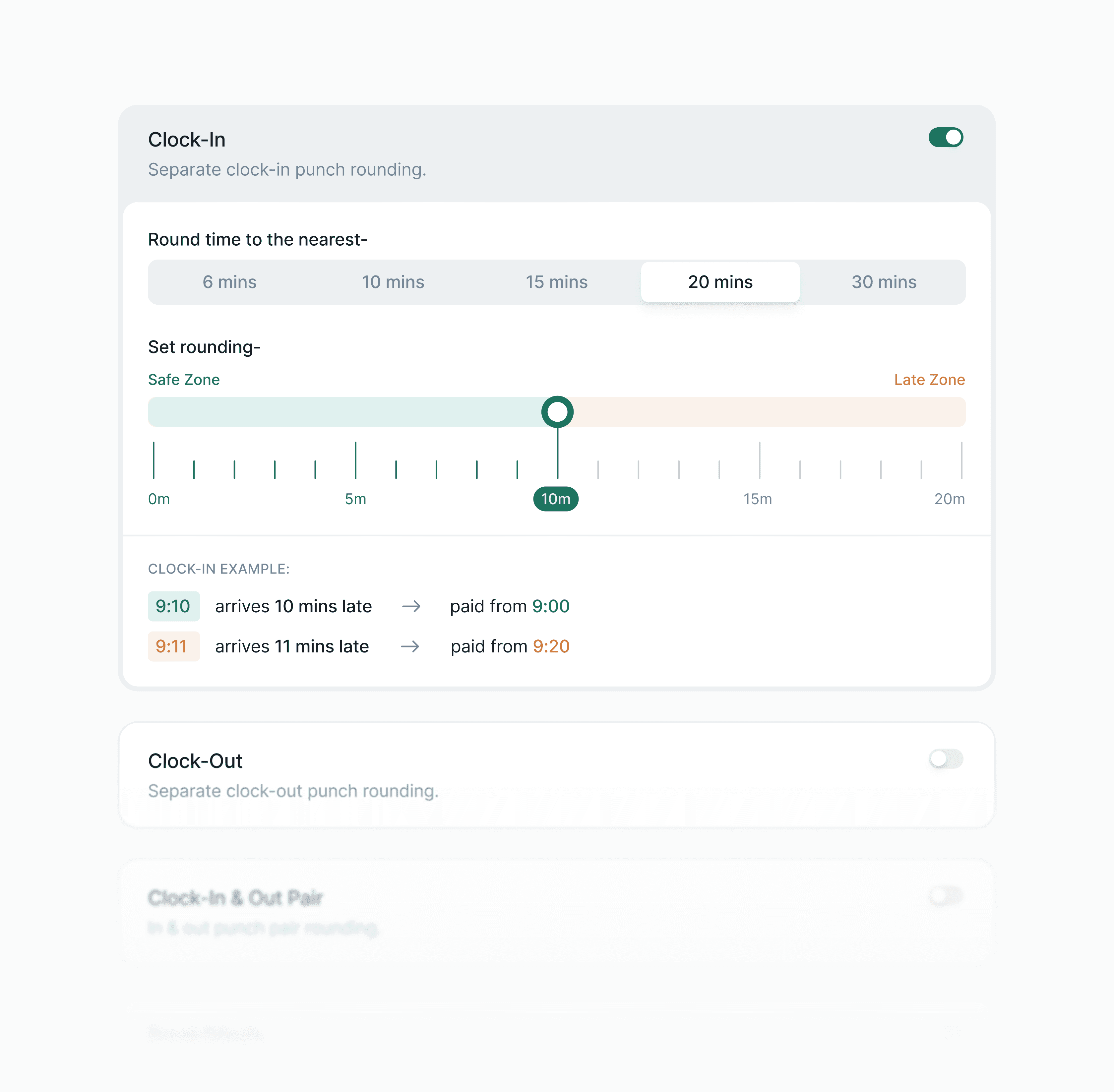
I pushed for inline timeline band diagrams on every rounding screen, colour-coded early and late zones, specific minute examples, real punch scenarios ("arrives 12 mins early → paid from 8:00", "arrives 13 mins early → paid to 7:45").
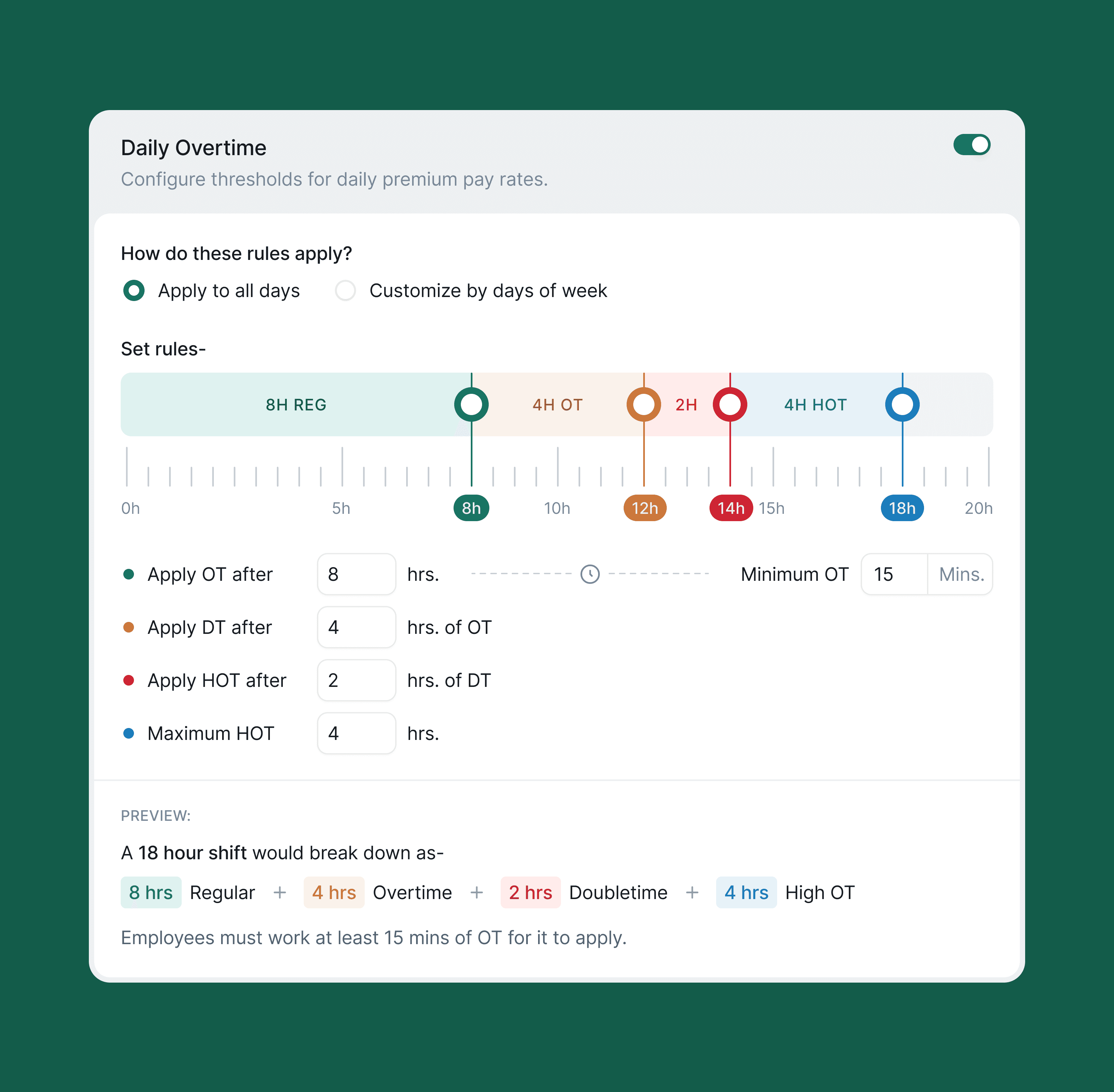
The diagrams update as the user adjusts settings. I also designed three explicit policy types- Pay (Employees), Bill (Clients), and Bill sync'd to Pay, to reflect the dual-sided financial reality of staffing agencies, with Pay marked RECOMMENDED to reduce setup friction for new accounts.
Design Decision #2
Separating shift types, meal rules, and break rules into three distinct lists, not one
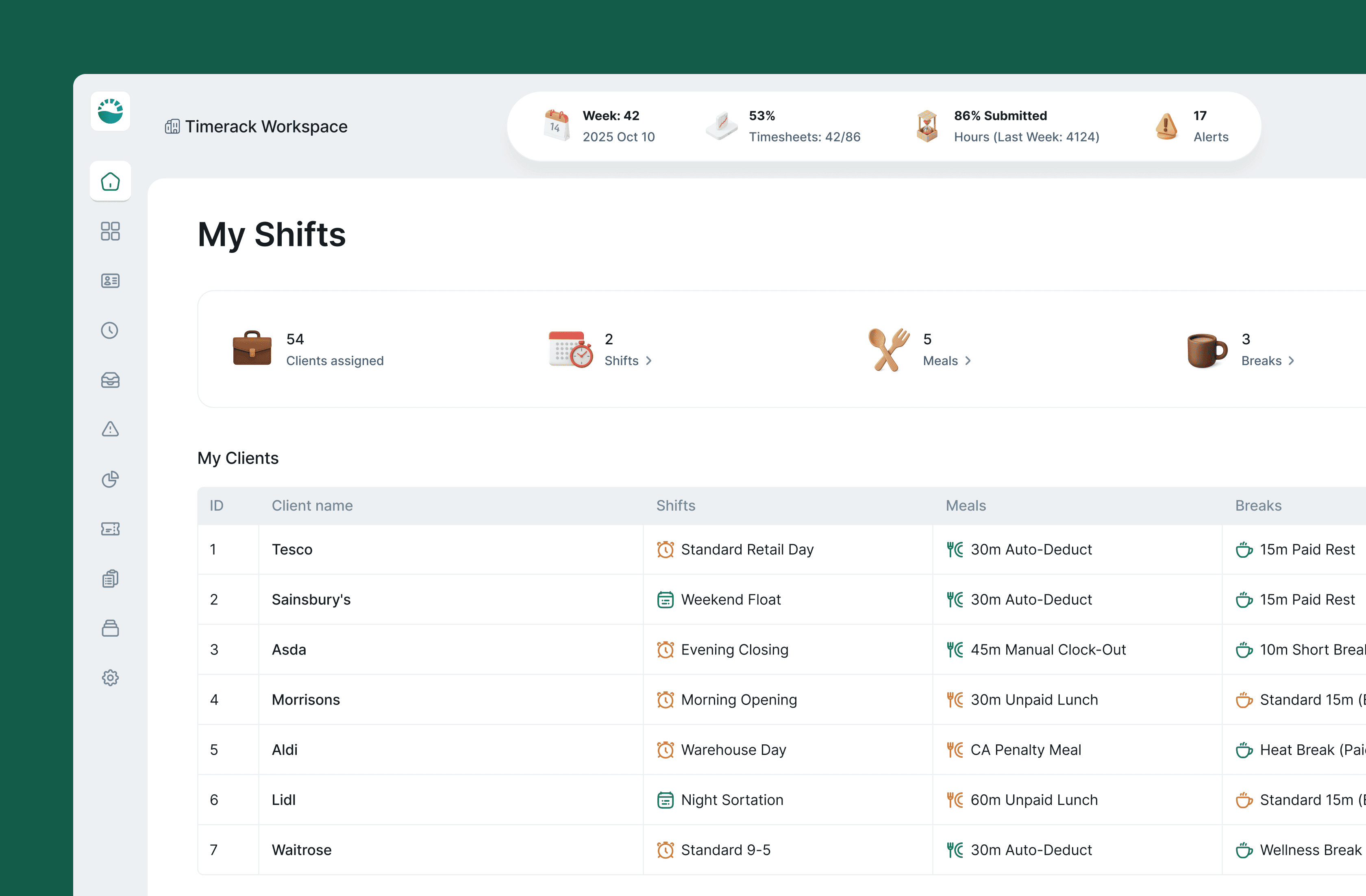
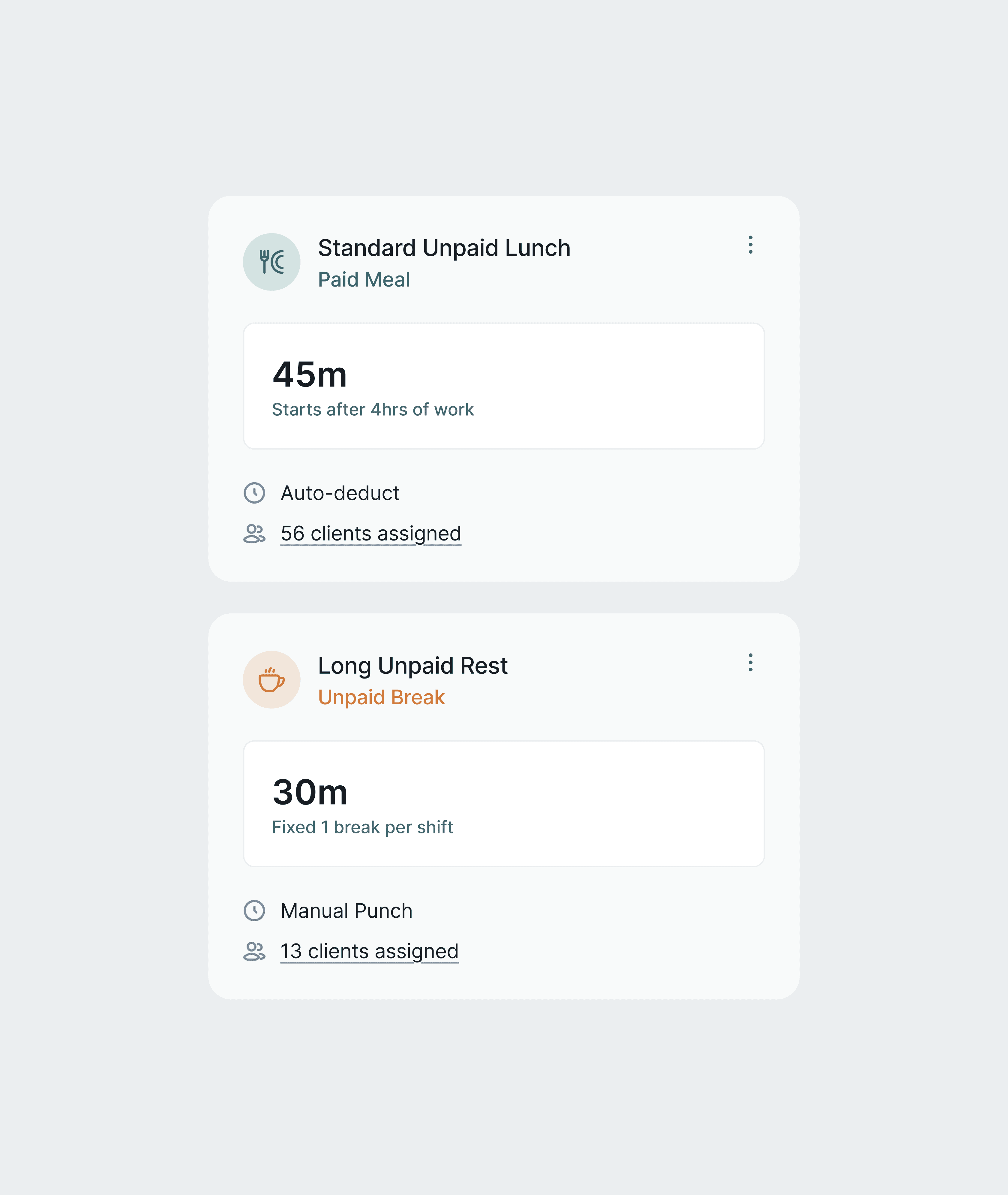
An early version of the Shifts module grouped shifts, meals, and breaks into a single tabbed list. The problem: they have completely different configuration surfaces and compliance implications. A break is compensated or not. A meal period may trigger a California penalty if it runs long. A shift can be Flexible (open-ended) or Recurring (fixed schedule). Treating them as one list forced the UI to either hide fields conditionally or show a confusing mix of irrelevant options.
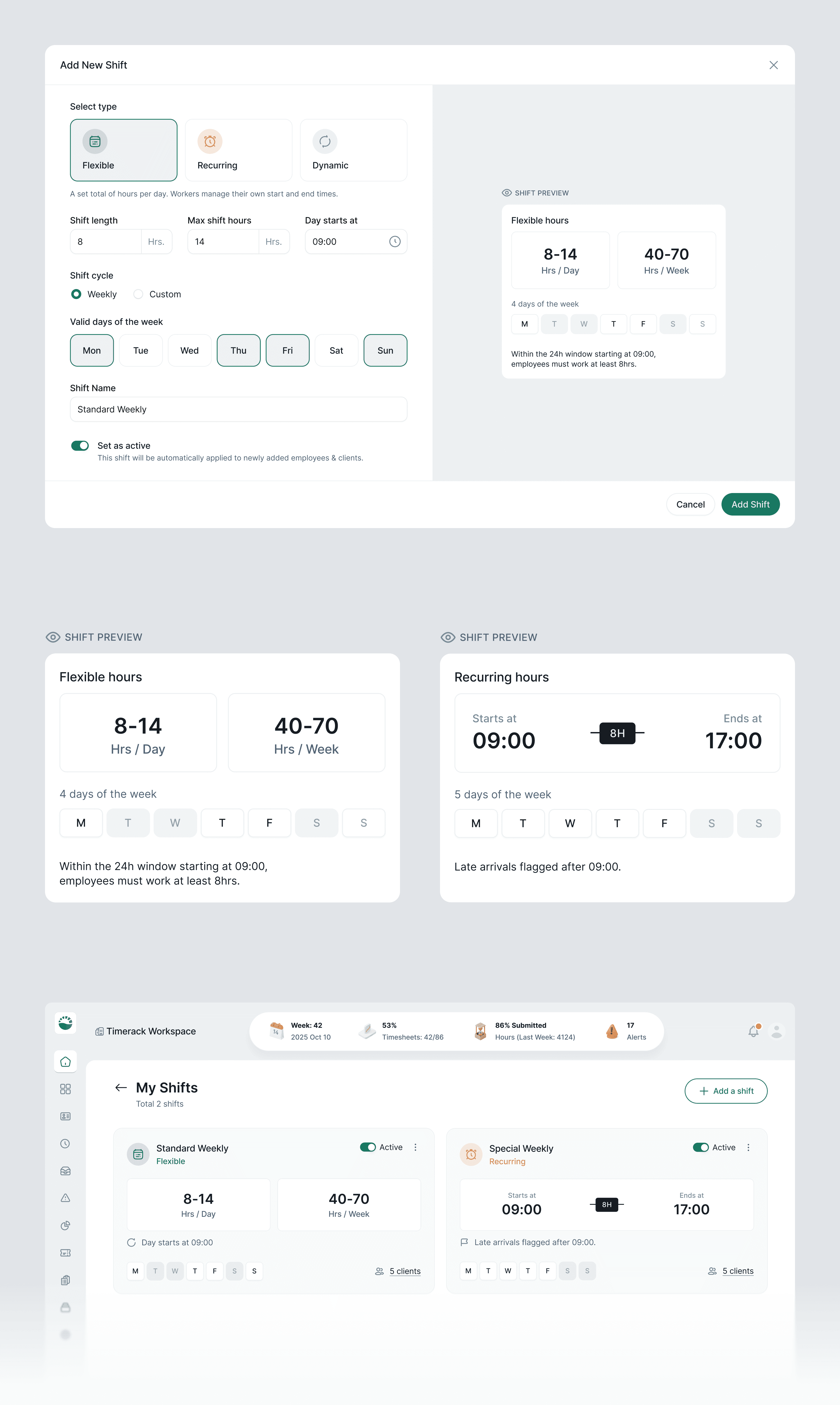
I separated them into three dedicated management tables: Shifts List, Meals List, Breaks List, each with its own creation flow. The Create Break screen explicitly distinguishes Paid vs. Unpaid at the top, because that single toggle determines whether workers are compensated for break time and whether it counts toward daily OT calculations. The Create Meal screen mirrors this pattern. This sounds obvious, but the original design buried paid/unpaid as a checkbox at the bottom of a long form.
Tradeoff: Three lists means more navigation. I kept them all nested under the Shifts section in the sidebar rather than promoting each to its own nav item, they're related configuration objects, not independent features.
Design Decision #3
Mapping templates to survive the "every ATS is different" problem
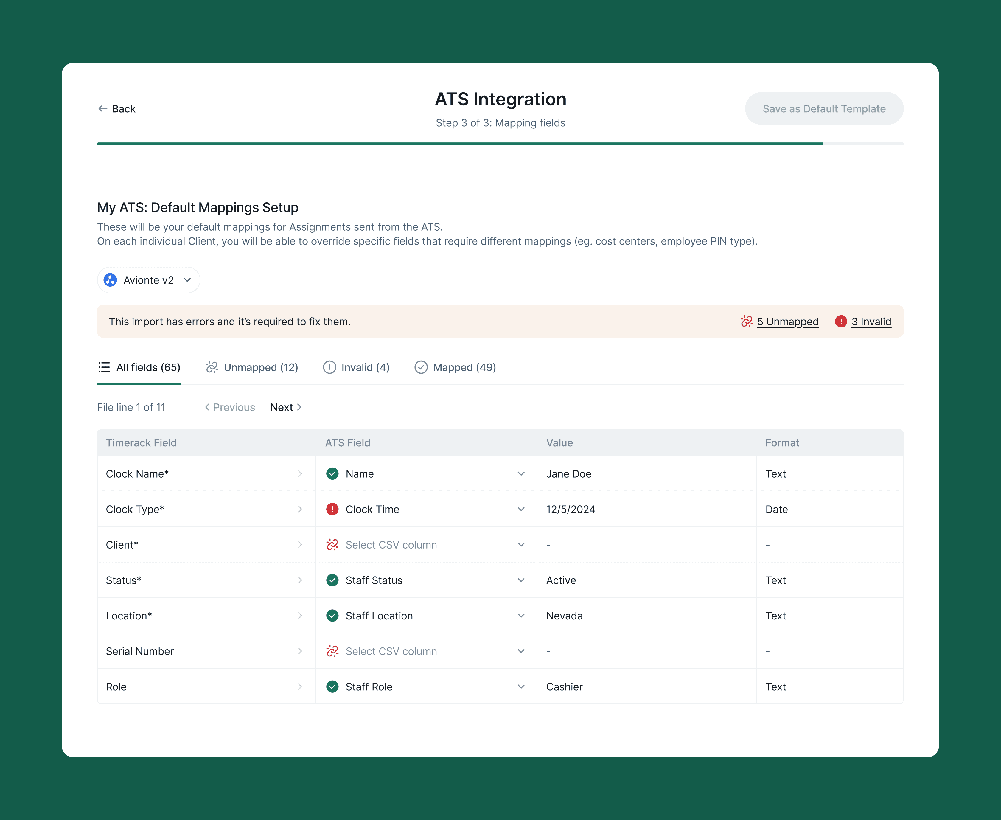
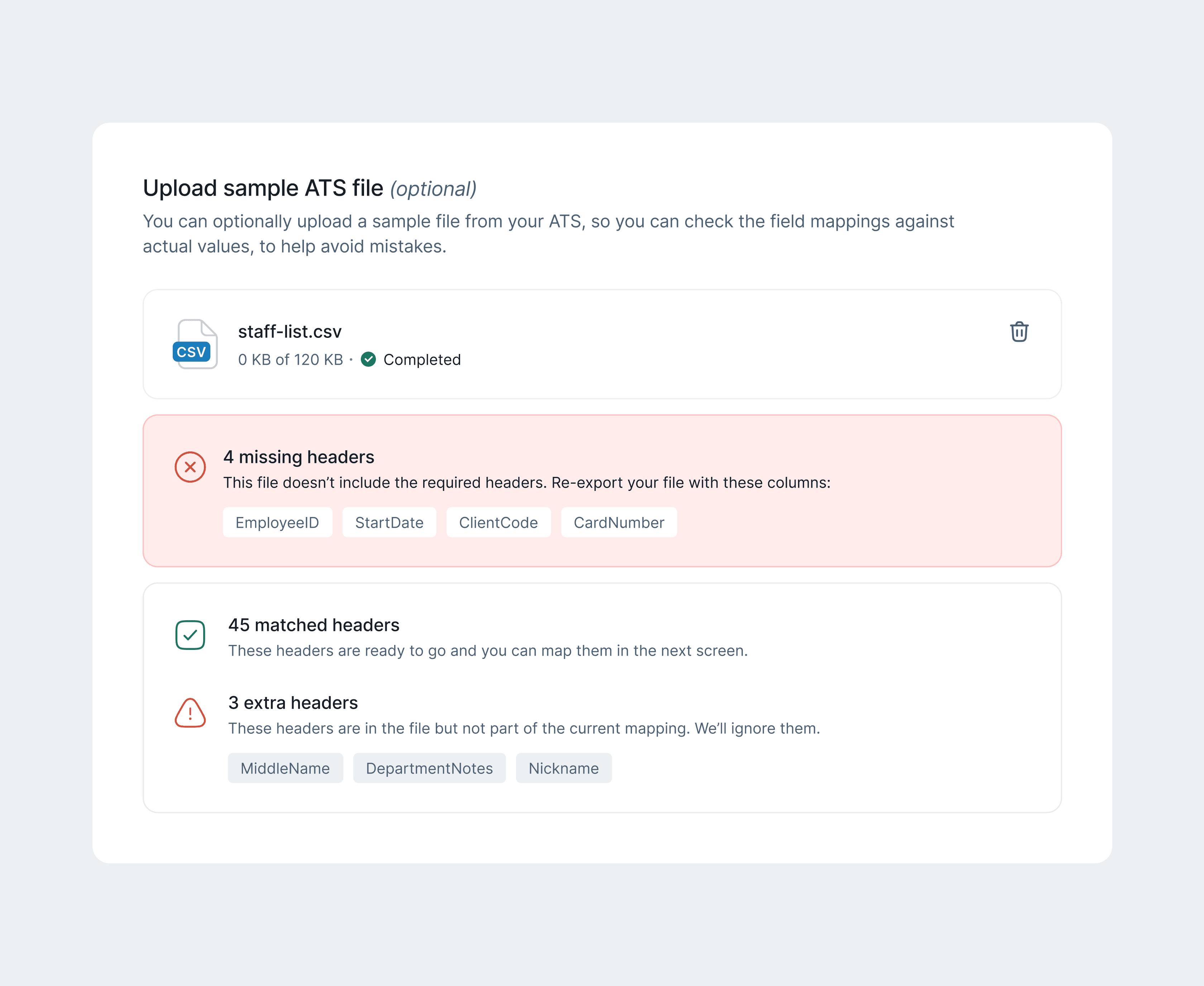
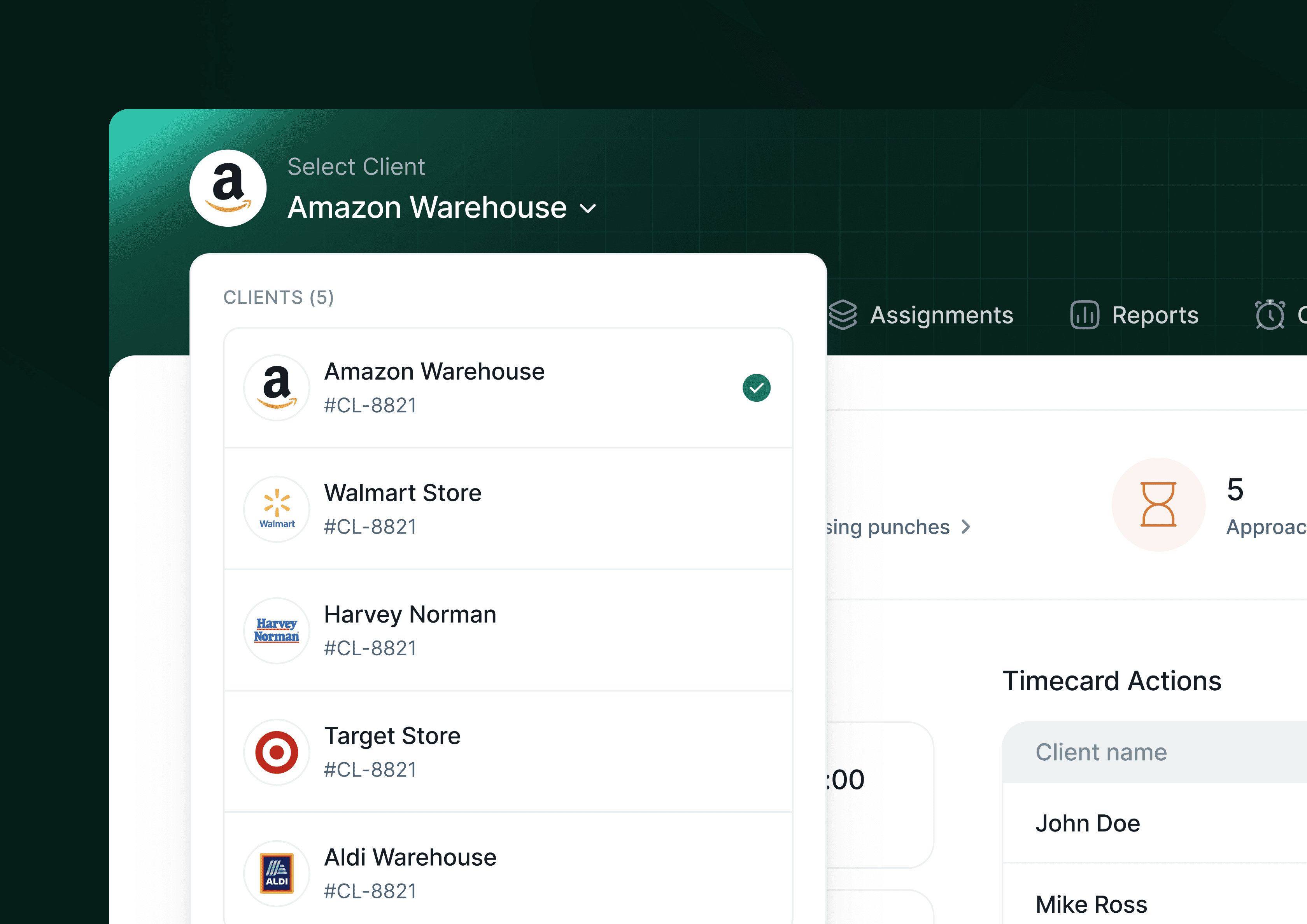
When a staffing agency imports worker data from their ATS- Bullhorn, JobAdder, Avionté, TempWorks, field names never match. What Bullhorn calls "Worker ID", JobAdder calls "Candidate Reference". The import would fail silently or corrupt data if users had to manually re-map every field every time.
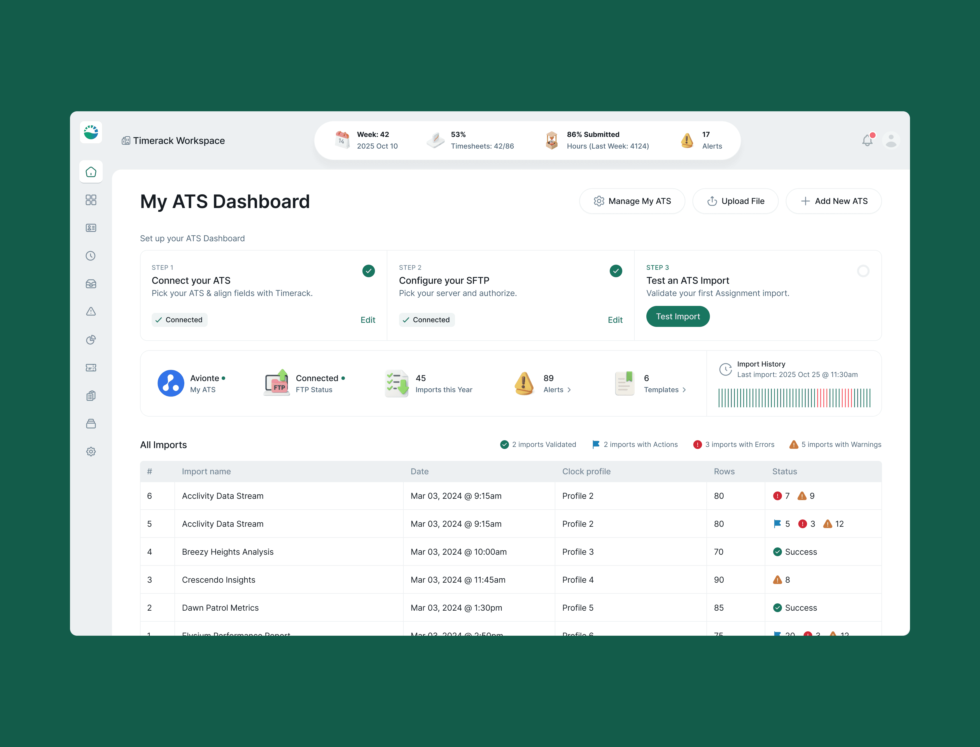
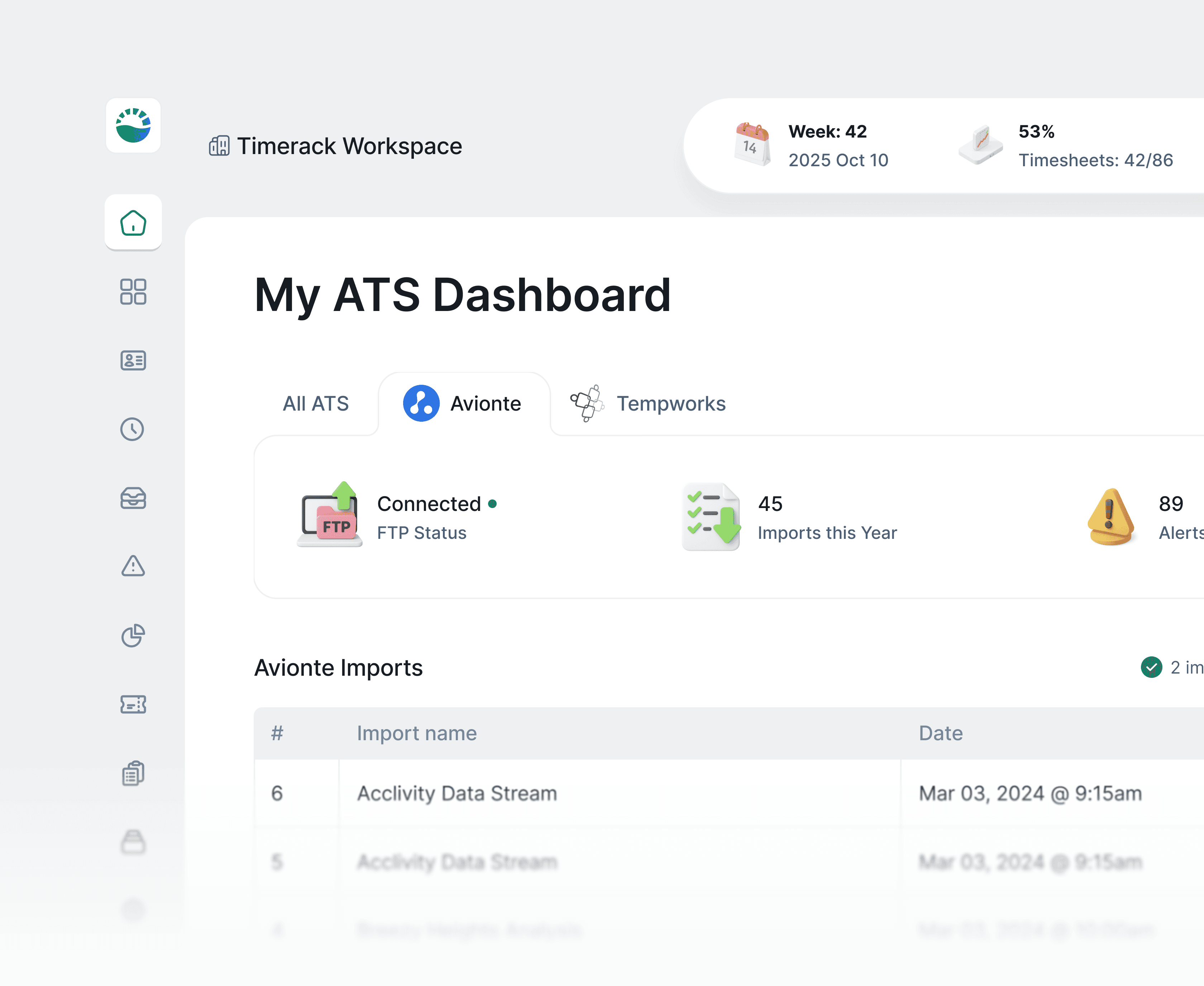
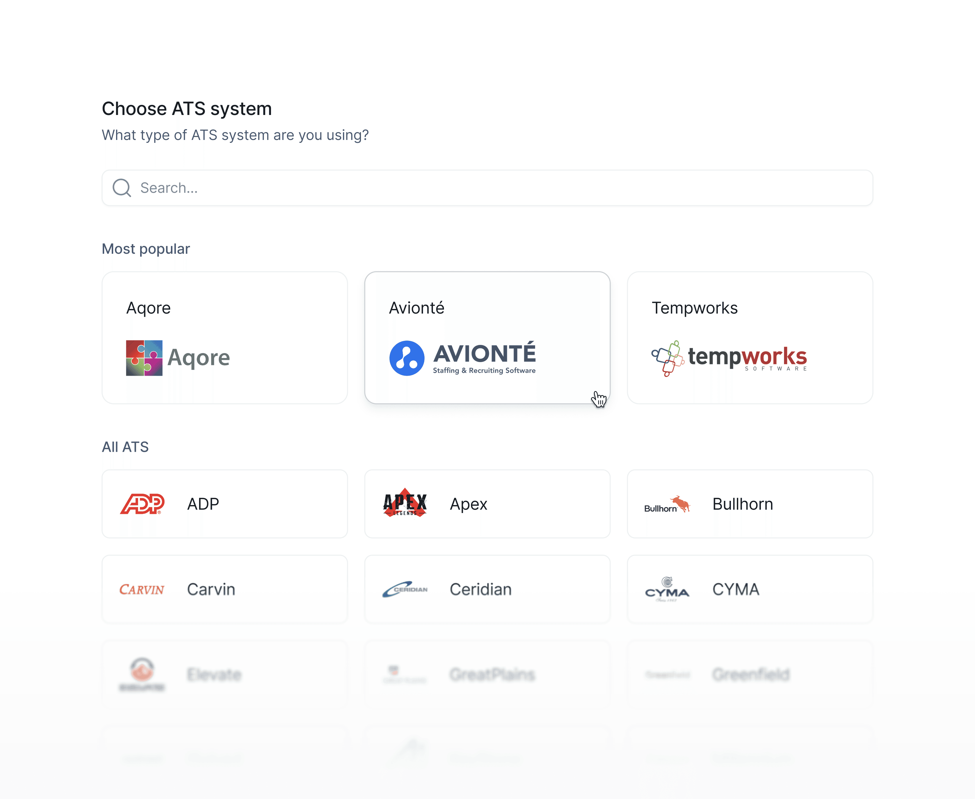
I designed a reusable mapping template system: the first time a user maps ATS fields to Timerack fields, they can save that configuration as a named template. Every subsequent import from the same ATS pre-fills the mapping automatically. The template dropdown appears inline in the Mapping Fields screen, surfacing previously saved configurations before the user has even touched a field.
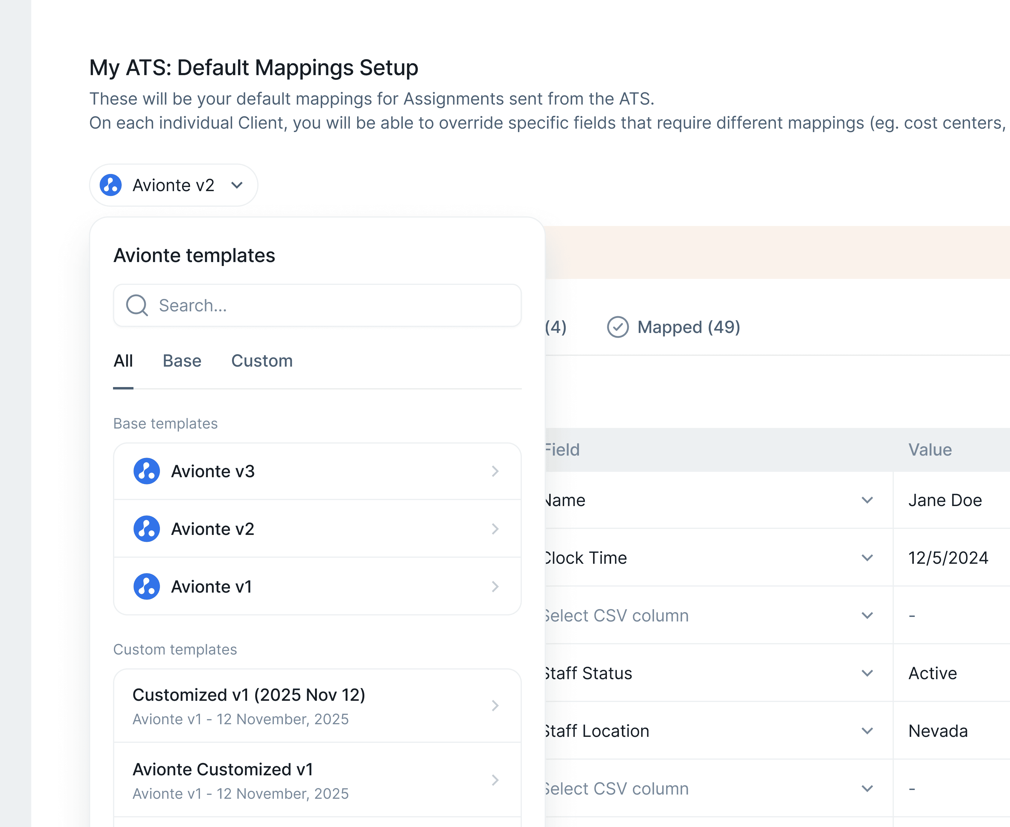
I also designed 7 distinct upload flow states- file selection, drag-and-drop active, upload progress, success, warning, error, and partial success, because the original design only had happy-path and generic error, and payroll admins need to know exactly which records failed and why before they can act.
Design Decision #4
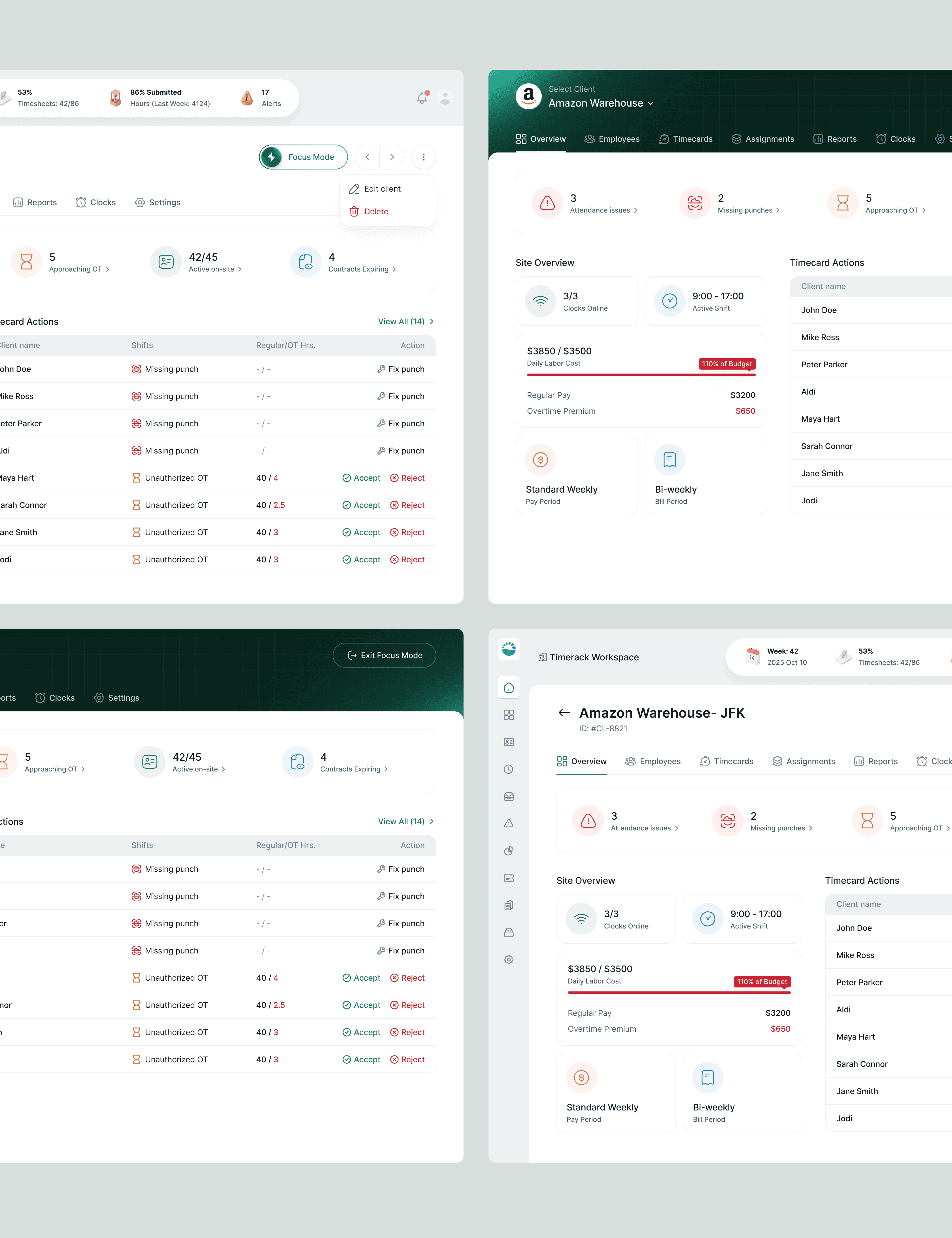
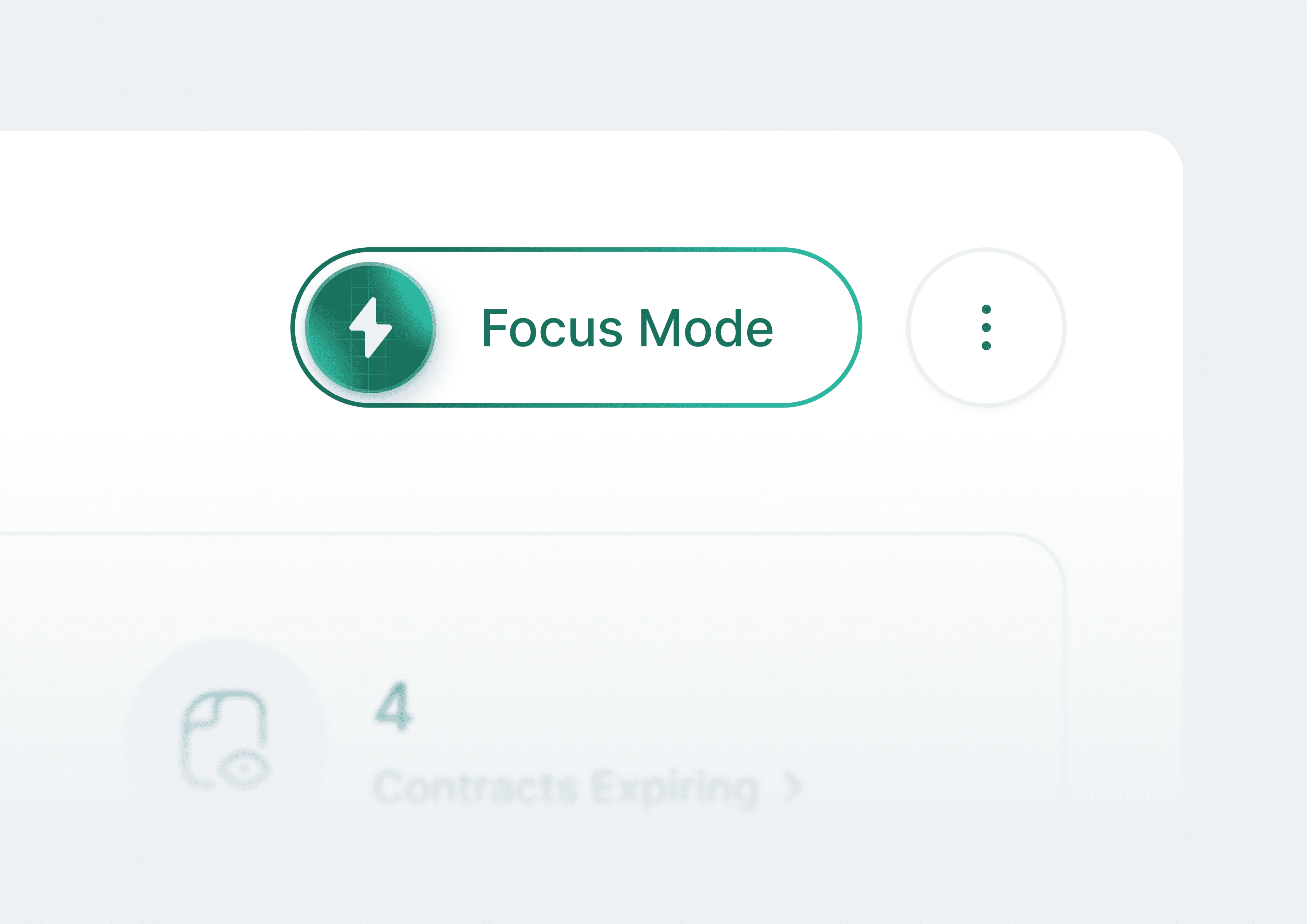
Focus mode that removes the platform to put one client front and centre
Operations managers frequently told us, through the underlying user research that informed the brief, that multi-client dashboards created cognitive load when they were trying to resolve a single urgent issue. Seeing other clients' alerts in the sidebar while trying to fix Amazon's missing punches was distracting and occasionally caused mis-actions (approving OT for the wrong site).
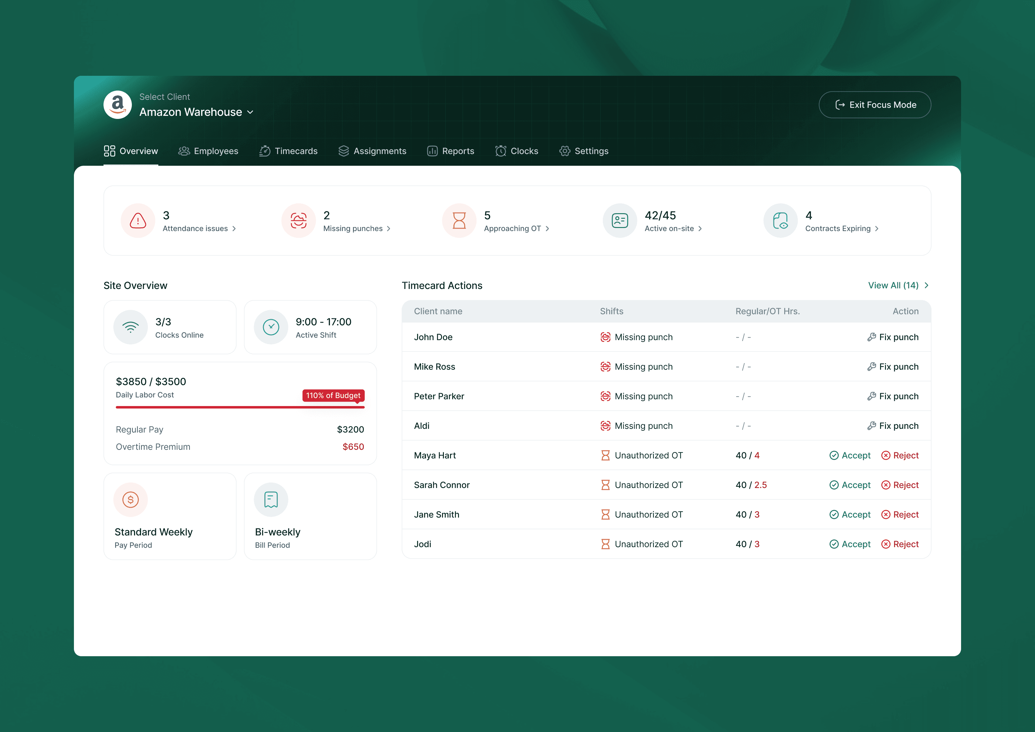
Focus Mode collapses the sidebar entirely and hides the global top nav, turning the client dashboard into a full-width, single-client view. The only exit is "End Focus Mode", a deliberate friction point that confirms the user is done with that client before they re-enter the multi-client context. The Timecard Actions queue and KPI strip remain fully functional in Focus Mode; nothing is hidden, only the surrounding navigation chrome.
Talking to users made it clear they don’t actually want to do both at once. Viewing is for presenting. Editing is for building. Separating them meant each screen could be designed for one job, and a persistent “Edit Scorecard” button on the view screen kept the transition quick. The tradeoff: an extra click to get between modes, turned out not to matter.
Outcome
A platform that can finally replace the spreadsheet
The design shipped across two versioned milestones so far with iteration happening in tight cycles between versions. The design system is mature and consistent across all 100+ screens.
The most meaningful outcome isn't a single metric- it's that the product now has a credible answer to its hardest sales objection: "Is it worth ripping out a working spreadsheet process?" The compliance engine and visual policy tools make the case visible in a demo.
Reflection
What was unusual…
Domain learning never stopped. Unlike most projects where you do a research sprint and move on, this one required constantly re-entering the industry knowledge base- every new module brought new compliance edge cases and new business model nuances.
I used Gemini as a thinking partner throughout: for understanding labour law specifics, for pressure-testing design directions, and for exploring how analogous industries (tax software, legal compliance tools) had solved similar configuration problems. It compressed weeks of background reading into something I could interrogate in real time.